
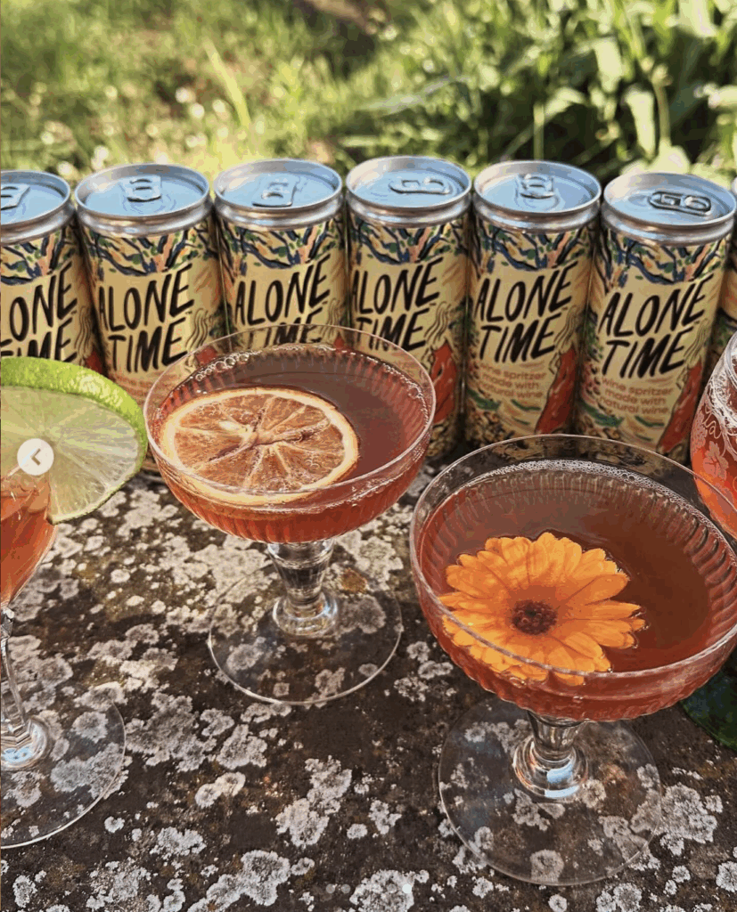
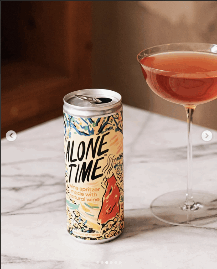
For Alone Time, Jimmy created a vibrant visual identity that captures the freedom, pleasure and slight mischief of taking a moment entirely for yourself. Designed for a natural wine spritzer, the packaging rejects the quiet restraint of traditional wine branding in favor of something immediate, expressive and full of life.
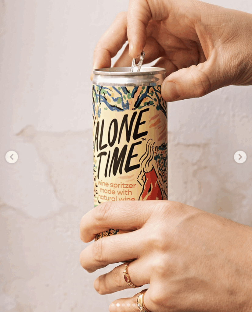
Jimmy’s hand-drawn lettering gives the name an easy confidence, while the wraparound illustration transforms the slender can into a compact work of art. Loose, energetic lines and a sun-soaked palette of yellow, coral, green and blue evoke warmth, movement and escape. The reclining figure at the center lends the design a playful intimacy, celebrating solitude as a luxury to be enjoyed.
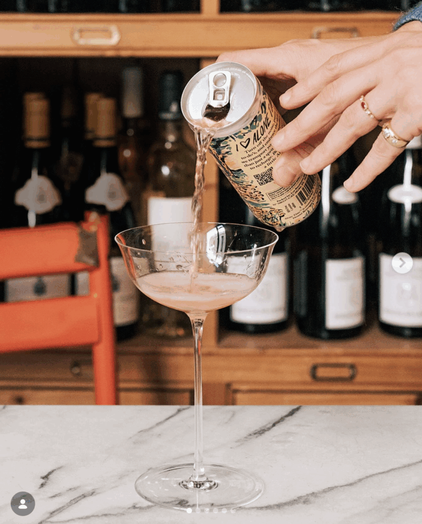
Every surface contributes to the story, allowing the artwork to unfold as the can is turned in the hand. The result is packaging with the spontaneity of a sketchbook and the presence of a poster—distinctive on the shelf, memorable at the table and perfectly suited to a wine made for drinking on your own terms.