illustration

  • Bar Sardine — Illustrated Brand Identity

    Jimmy developed a charming, illustration-led brand identity for Bar Sardine, bringing the spirit of the cozy West Village spot to life through character design, hand-lettering, and playful visual storytelling. The system centers on a debonair, mustachioed waiter—equal parts caricature and icon—drawn in Jimmy’s loose, expressive linework. With his exaggerated posture, crisp bowtie, and effortless confidence, the character instantly conveys the personality of the bar: intimate, stylish, and a little mischievous.

    The identity expands across touchpoints with a warm, analog sensibility.
    • Matchbooks feature the full character illustration, printed simply and elegantly for an old-New-York touch.
    • Coasters reinterpret the figure with a whimsical twist—extending his arm in a dramatic flourish, echoing the bar’s sense of performance and charm.
    • Brand patterns and textures use soft, painterly stripes and hand-drawn lettering in muted greens and warm neutrals, keeping the palette understated but distinctive.

    Every piece feels sketched by hand, yet refined enough for a hospitality brand. The illustrations balance sophistication with a wink, creating a visual language that’s approachable, memorable, and unmistakably Bar Sardine. Jimmy’s work distills the venue’s character into a suite of tactile, art-driven objects—turning everyday bar ephemera into miniature works of identity design.

  • The Georgian Hotel

    Client: The Georgian Hotel, Santa Monica | Project: Illustrations & Brand Collateral

    Jimmy partnered with The Georgian, Santa Monica’s iconic Art Deco hotel, to create a collection of bespoke illustrations that celebrate the property’s history, architecture, and timeless glamour. Known as the “First Lady of Santa Monica,” The Georgian carries with it a rich legacy of Hollywood allure and coastal elegance—a story Thompson translated into visual form.

    For this project, he developed a series of hand-drawn illustrations infused with watercolor washes, merging architectural detail with playful nostalgia. Subjects include the hotel’s lion gargoyles, vintage telephones, and mythic cherubs, each reinterpreted through Thompson’s expressive linework and light washes of color.

    These illustrations were applied to a variety of brand elements, most notably:

    • Custom Coasters – featuring rotating illustrations, offering guests an intimate connection to the hotel’s character.
    • Decorative Touchpoints – imagery integrated throughout the property’s printed collateral, reinforcing the brand’s narrative.
    • Art-Inspired Branding – extending the hotel’s legacy as an artistic and cultural landmark into its everyday guest experience.

    The collaboration reflects Thompson’s ability to honor history while making it feel fresh and contemporary. His work for The Georgian communicates:

    • Heritage – capturing the grandeur of the Art Deco period with nods to the building’s historic details.
    • Whimsy – infusing personality and charm into objects and motifs that might otherwise be overlooked.
    • Luxury Storytelling – creating art that elevates guest experience and deepens their sense of place.

    Through this project, Jimmy Thompson demonstrated his talent for aligning illustration with hospitality branding, helping The Georgian deliver not just a stay, but a storied experience that celebrates Santa Monica’s coastal legacy.

  • Mes Amis

    Jimmy partnered with Mes Amis, the Los Angeles restaurant by acclaimed chef Lincoln Carson, to create a series of hand-drawn illustrations that capture the warmth, sophistication, and conviviality of the dining experience.

    The visual identity features expressive ink-style drawings of intimate dinner parties, bar conversations, and refined service—scenes that echo the restaurant’s ethos of timeless hospitality. These illustrations were seamlessly integrated into the logo, menus, business cards, and packaging, establishing a cohesive identity rooted in artistry and storytelling.

    Thompson’s drawings elevate Mes Amis beyond a dining space, transforming it into a living tableau of friendship and culture. His collaboration demonstrates:

    • Narrative illustration – bringing to life the social rituals of dining with fluid, character-driven sketches.
    • Hospitality branding – translating atmosphere into visual identity for menus, collateral, and guest touchpoints.
    • Timeless elegance – balancing Parisian café nostalgia with contemporary Los Angeles sophistication.

    From hand-sketched logos and signage to bespoke business cards and shopping bags, Jimmy Thompson’s work for Mes Amis gives the restaurant a visual soul—an identity that feels personal, memorable, and effortlessly chic.

  • National Geographic — Flowers Collection

    For National Geographic’s Flowers Collection, Jimmy created a vibrant series of botanical illustrations that reinterpret the natural world through bold color palettes, abstract textures, and contemporary form.

    This series includes iconic species such as the Forest Lily, Bromeliad Flower, Lobster Claw Plant, Corpse Flower, Rafflesia, Cup Fungus, Anthurium, Philodendrons, and Bird of Paradise. Each artwork transforms the familiar into something newly striking—balancing scientific accuracy with artistic imagination.

    Thompson’s process blends digital painting with traditional printmaking aesthetics, giving the works a tactile, layered feel that resonates with both editorial storytelling and gallery settings. His approach emphasizes clarity, curiosity, and wonder, aligning seamlessly with National Geographic’s mission to illuminate and inspire connections with the natural world.

    The Flowers Collection stands as a testament to Thompson’s ability to adapt his visual language for cultural institutions and global audiences. It demonstrates his strength in:

    • Scientific storytelling through art – interpreting biological subjects with precision and accessibility.
    • Bold visual experimentation – using unexpected colorways and textures to reframe perception.
    • Client collaboration – delivering a suite of cohesive works that support National Geographic’s brand identity and editorial excellence.

    With this project, Jimmy Thompson reaffirms his role as a visual interpreter of nature—an artist capable of translating the complexity and beauty of the living world into iconic, memorable design.

  • Bettina Santa Barbara — Illustrated Tee Design

    Jimmy Thompson created this lively, hand-drawn illustration for Bettina, the beloved Santa Barbara restaurant known for its wood-fired pizzas and convivial atmosphere. The design captures the spirit of a bustling Bettina evening—friends gathered around a table, the glow of the oven, bottles uncorked, and the joyful chaos of good food shared.

    Rendered in Thompson’s expressive linework and accented with a playful, limited palette of mint and lavender, the artwork evokes a loose, spontaneous sketchbook quality. Figures, pizza slices, wine glasses, and architectural hints of Santa Barbara blend into a vibrant scene that feels both whimsical and unmistakably local.

    Printed on a classic white tee, the illustration transforms a simple garment into a narrative moment: a snapshot of Bettina’s warmth and energy, interpreted through Thompson’s signature visual voice. The result is a keepsake that celebrates community, dining, and the artistry of everyday experiences.

  • Marine & Lawn – Holiday Illustrations for Scotland’s Iconic Hotels

    For Marine & Lawn Hotels & Resorts, Jimmy created a series of evocative holiday illustrations that bring a touch of seasonal magic to some of Scotland’s most storied destinations. Capturing the stately architecture of these historic properties under a gentle snowfall, each illustration conveys the warmth, tradition, and elegance of winter by the sea. These bespoke artworks were featured on the brand’s website and digital campaigns, reinforcing Marine & Lawn’s identity as a collection of timeless resorts set against the rugged beauty of the world’s most coveted golf courses.

  • Taylor Stitch – High Desert Capsule

    In collaboration with Taylor Stitch, Jimmy created a series of original textile prints inspired by the American Southwest. From hand-drawn Joshua trees and rugged desert landscapes to bold florals, his artwork translates the vastness and romance of the high desert into wearable pieces. Each shirt and bandana becomes a canvas—blending fine art with timeless craftsmanship.

  • Emmy’s Nominee Celebration – Chateau Marmont


    For the 2024 Emmy’s celebration at Chateau Marmont, Jimmy brought his signature line work to life across an immersive series of custom artworks. He hand-painted large-scale backdrops, bar panels, and decor with bold, gestural illustrations that set a playful, cinematic tone for the event. Guests were greeted with bespoke matchbooks and live drawing, where Jimmy sketched portraits and scenes in real time, turning the piano into a living studio. This collaboration merged fine art and hospitality, capturing the glamour and spontaneity of Hollywood’s awards season.

  • Crate & Barrel

    For Crate & Barrel’s New York flagship, Jimmy created a series of expressive black‑and‑white illustrations that transform familiar cityscapes—its bridges, boulevards, and landmark architecture—into scenes alive with movement. Rendered in his fluid, playful line work, the drawings capture the pulse of New York, distilling its energy and character into a whimsical visual narrative.

    Jimmy’s Evergreen Stationery collection for Crate & Barrel distills the essence of New York City into a series of fluid, hand-drawn illustrations. With a light, gestural line, these scenes—parks in bloom, iconic bridges, bustling plazas, and beloved landmarks—capture the city’s rhythm and timeless charm, turning everyday views into artful moments meant to be kept, shared, and revisited.

    For Crate & Barrel’s holiday stationery collection, Jimmy infused his lively hand-drawn style with a touch of festive color. From city stoops draped in garlands to the iconic Rockefeller Center tree, these illustrations capture the magic of the season in New York—playful, warm, and brimming with the joy of winter in the city.

  • Petit Trois — “Butter” Tee Illustration

    Jimmy created this playful, hand-drawn illustration for Petit Trois, the celebrated Los Angeles bistro known for its unapologetically French cooking. The design features a stack of bright yellow butter blocks—an affectionate nod to the restaurant’s signature ingredient and the backbone of classic French cuisine.

    Rendered with loose, expressive linework and intentionally imperfect strokes, the illustration captures Thompson’s sketchbook immediacy and sense of humor. The repetition of the word BUTTER across each block feels both iconic and tongue-in-cheek, functioning as a graphic mantra for a kitchen where butter is philosophy as much as flavor.

    Printed on a clean white tee, the artwork pairs a minimalist composition with a bold pop of color—creating a wearable piece of branding that feels casual, charming, and unmistakably Petit Trois. The result is a chef-approved graphic that celebrates the restaurant’s spirit: simple ingredients elevated through craft, personality, and a lot of butter.

  • Amazon MGM Studios × Golden Globes — Limited Edition Art Card

    For the  Amazon MGM Studios x Golden Globes collaboration, Jimmy Thompson was commissioned to create a bespoke illustration and visual vignette celebrating the studio’s awards-season slate. The final piece blends his signature hand-drawn style with cinematic symbolism, resulting in a collectible art card presented alongside Amazon MGM’s official event packaging.

    Set against a rich, theatrical backdrop, the illustration features a dual-sided character rendered in stark ink textures—evoking themes of duality, performance, and the shadowed psychology of drama. Thompson’s linework channels a mythic, tarot-like sensibility, while the mirrored composition nods to the idea of an actor’s many faces. Subtle motifs—outstretched hands, stylized initials, and atmospheric shading—anchor the drawing in a world of suspense and narrative tension.

    The card was displayed as part of Amazon MGM’s Golden Globes promotional materials, pairing hand-crafted illustration with the studio’s abstract, painterly branding. Together, the elements create a tactile, art-forward moment within the high-gloss world of award-season marketing—highlighting Thompson’s ability to unify traditional drawing with contemporary brand storytelling.

  • National Geographic — Newly Found Dinos Illustration Series

    Commissioned by National Geographic, Jimmy created a bold, high-impact illustration series celebrating newly discovered dinosaur species from around the world. Designed to engage a younger audience, the series blends scientific facts with expressive typography, energetic color palettes, and character-driven dinosaur drawings—transforming paleontology into something playful, accessible, and visually electric.

    Each poster spotlights a different species—such as BathysaurusRegaliceratopsCaihong jujiStegouros elengassen, and Moros intrepidus—rendered in Thompson’s signature style: vibrant shapes, loose sketch-driven outlines, and a mix of matte and neon tones that bring prehistoric creatures into a modern visual language. Facts like height, weight, age, and discovery location are integrated directly into the compositions through hand-lettered typography, wrapping around and interacting with the dinosaurs themselves. This gives every piece a sense of motion and personality, turning raw data into graphic storytelling.

    Across the series, Thompson uses punchy, unexpected color combinations—lavender with mint, coral with deep green, teal with blush pink—to defy the earth-tone conventions of dinosaur art. Border motifs and layered textures echo zines, trading cards, and retro posters, grounding the project in a fun, editorially playful aesthetic aligned with National Geographic’s youth programming.

    The result is a set of illustrations that make science feel exciting and alive—bridging education and art through dynamic, contemporary design. Each piece invites the viewer into the world of newly discovered dinosaurs with curiosity, humor, and an unmistakable visual voice.

  • Taylor Stitch — Floral Textile DesignTaylor Stitch SS24

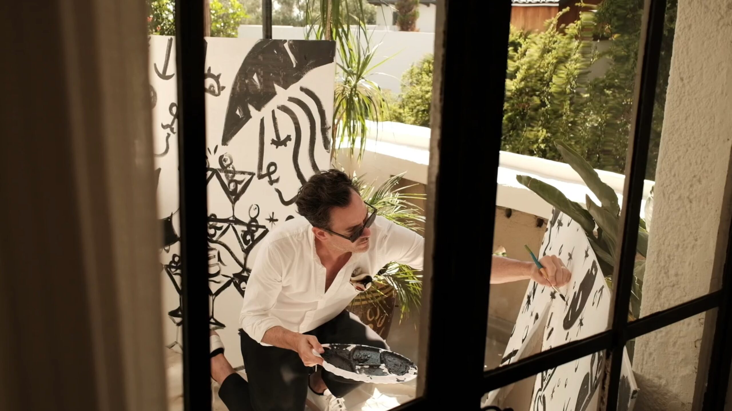
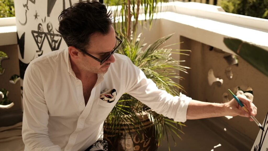
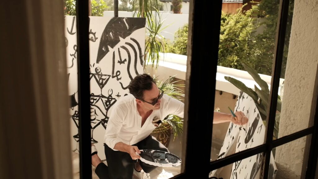
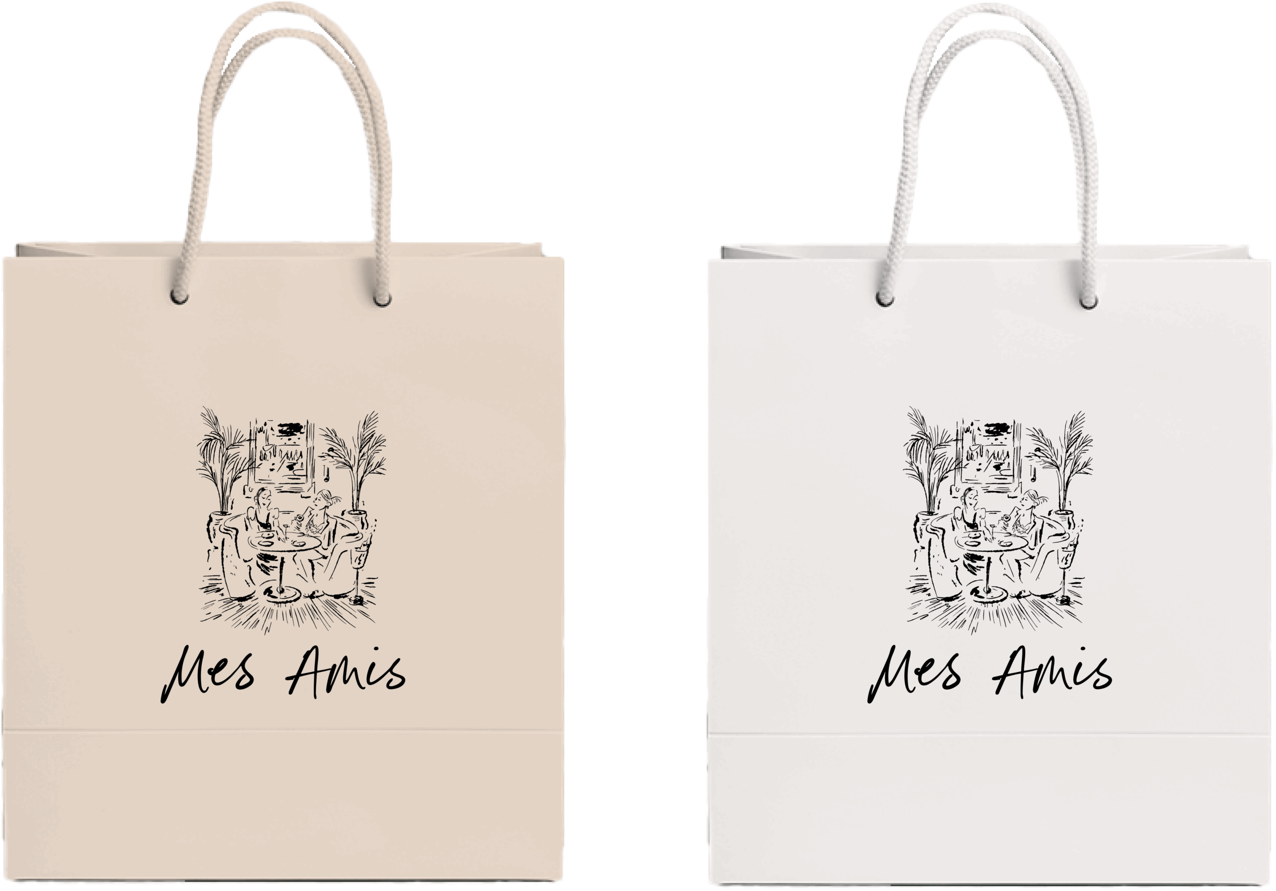
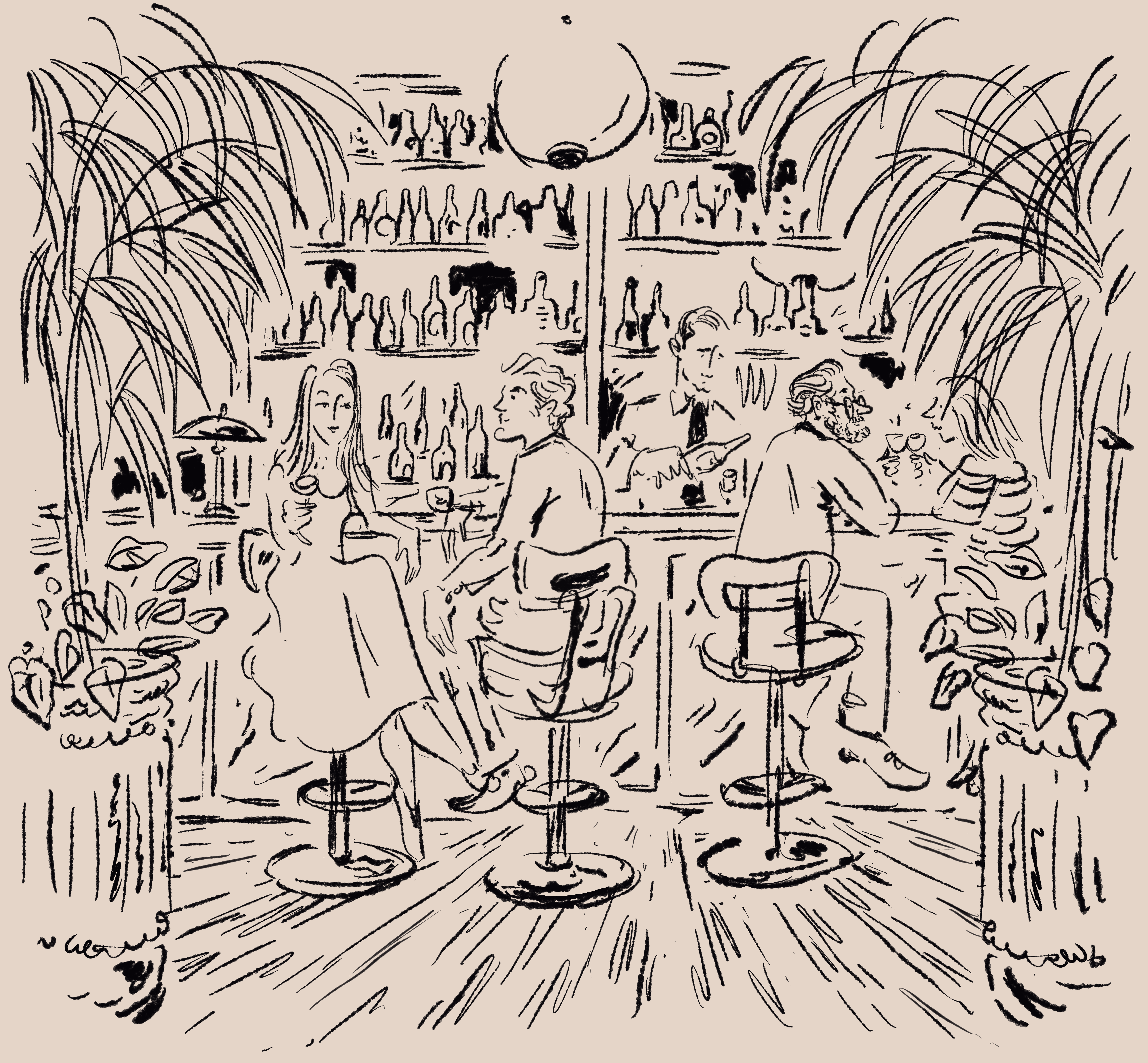
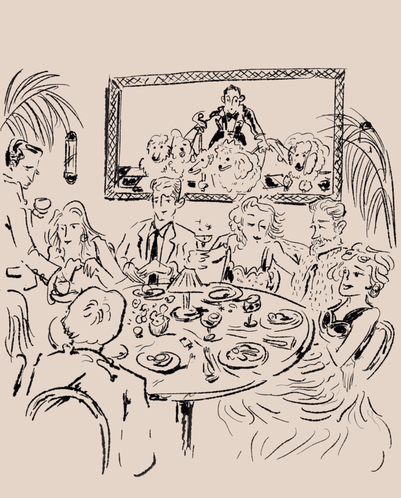
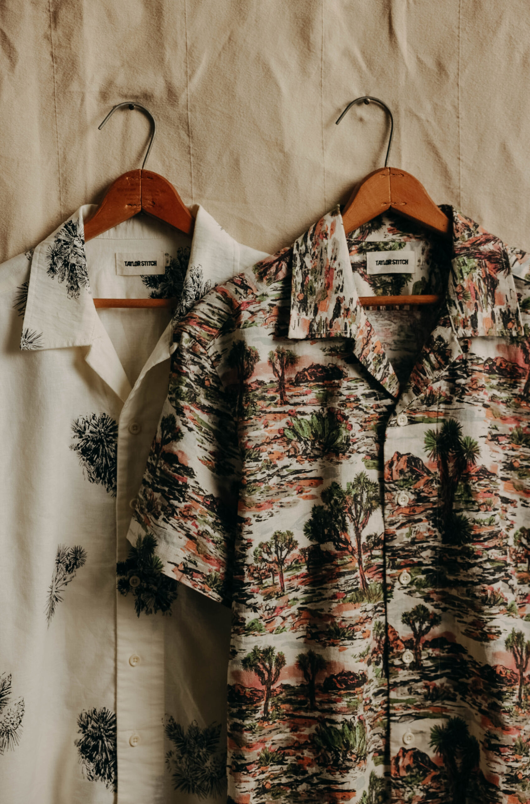
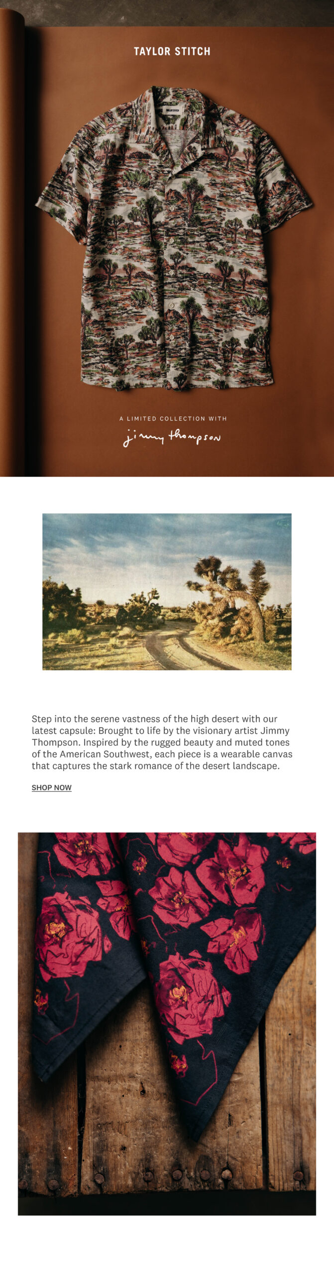
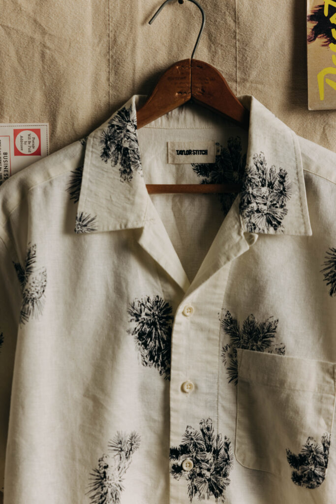
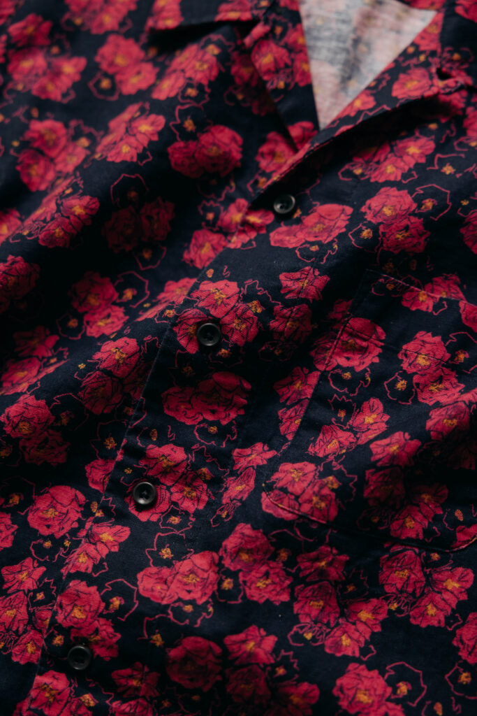
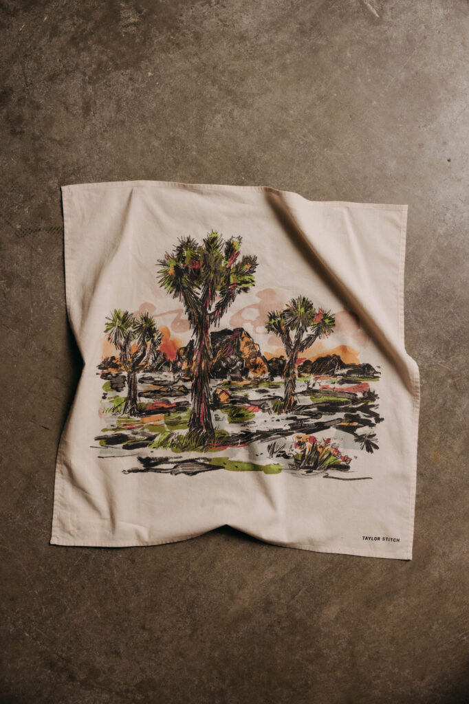
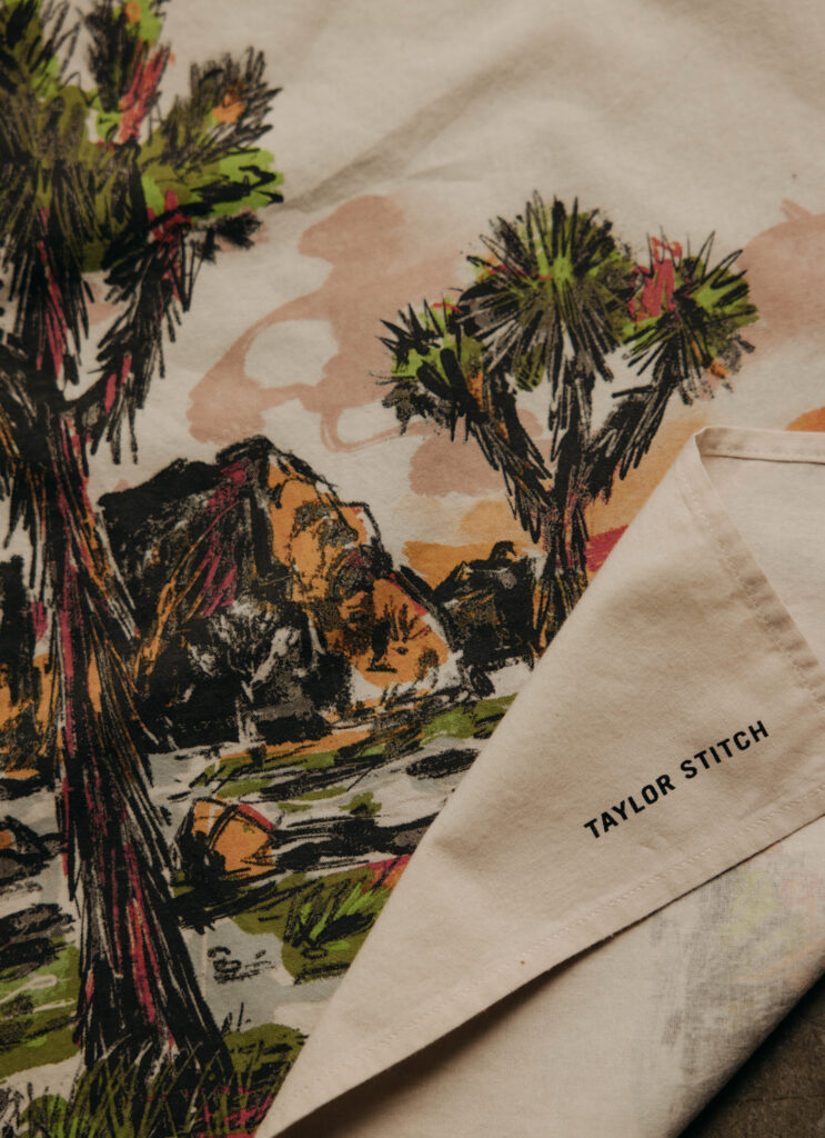
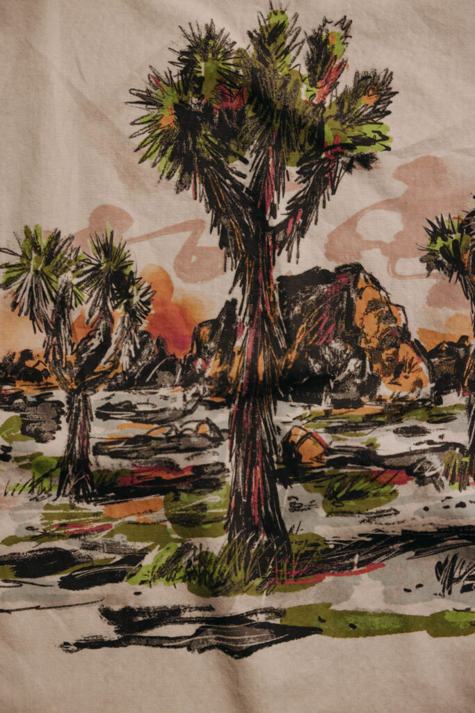
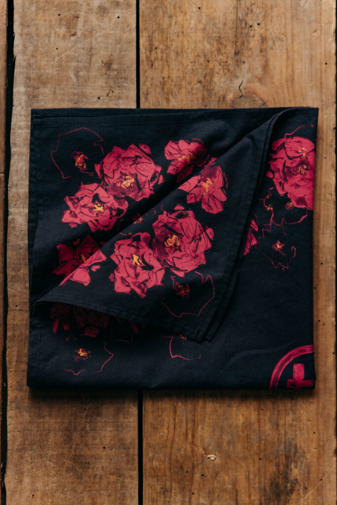
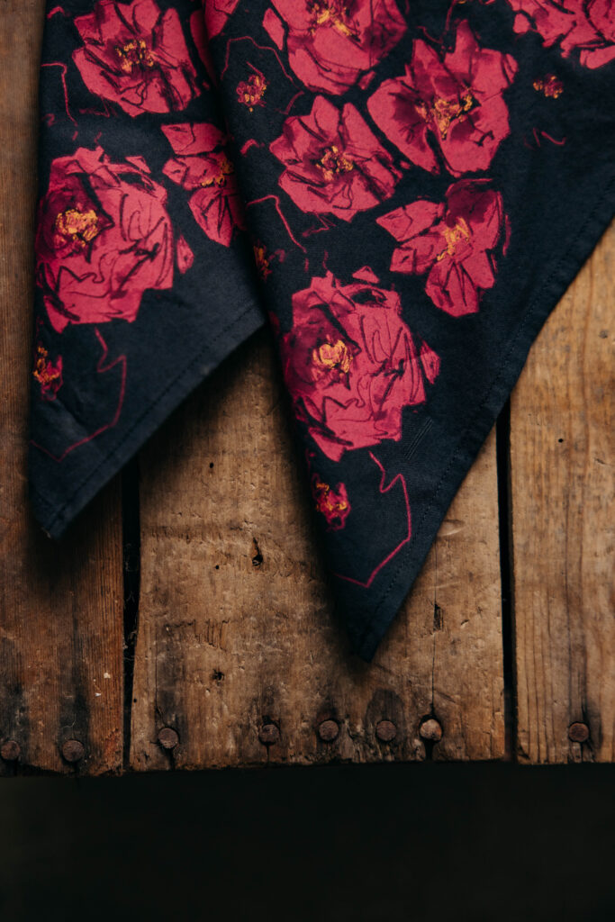
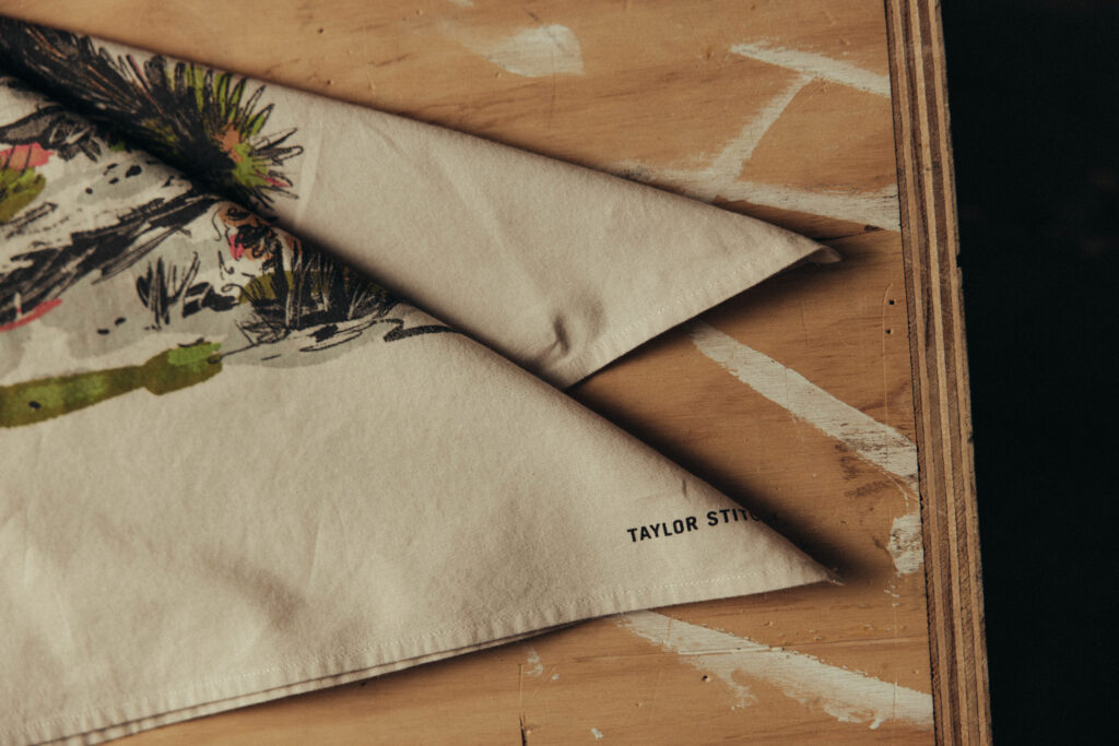
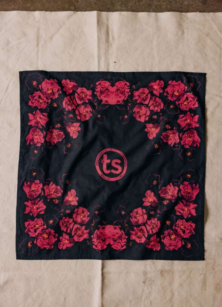
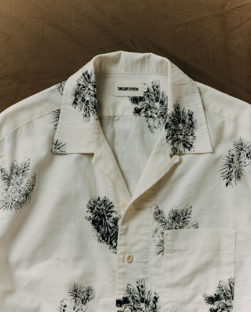
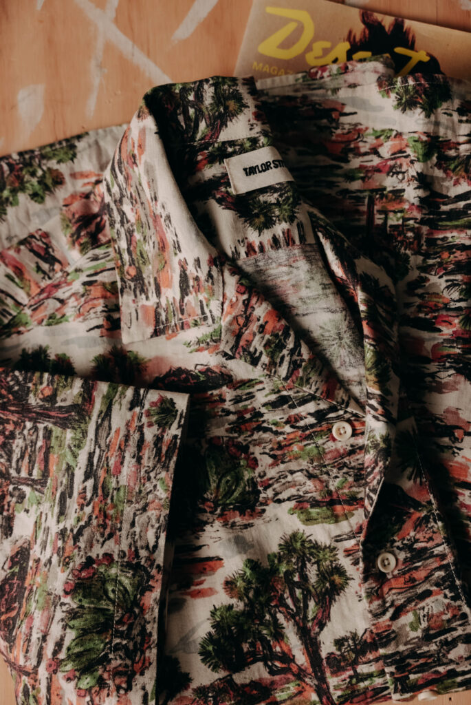
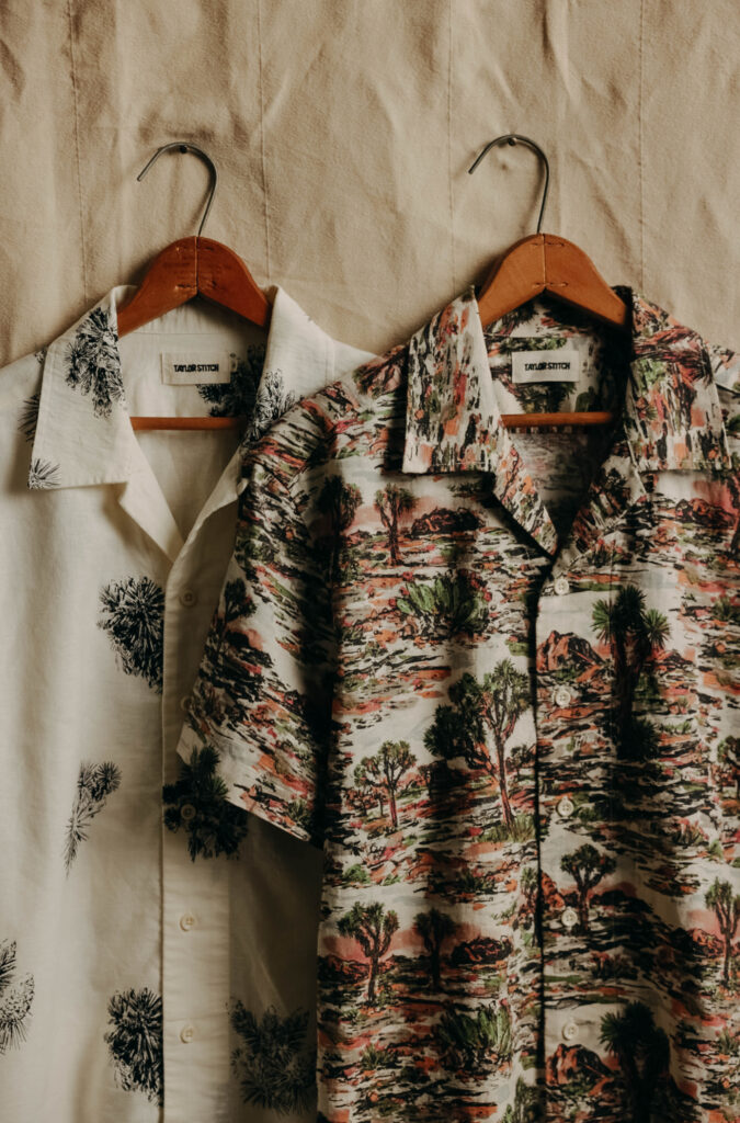
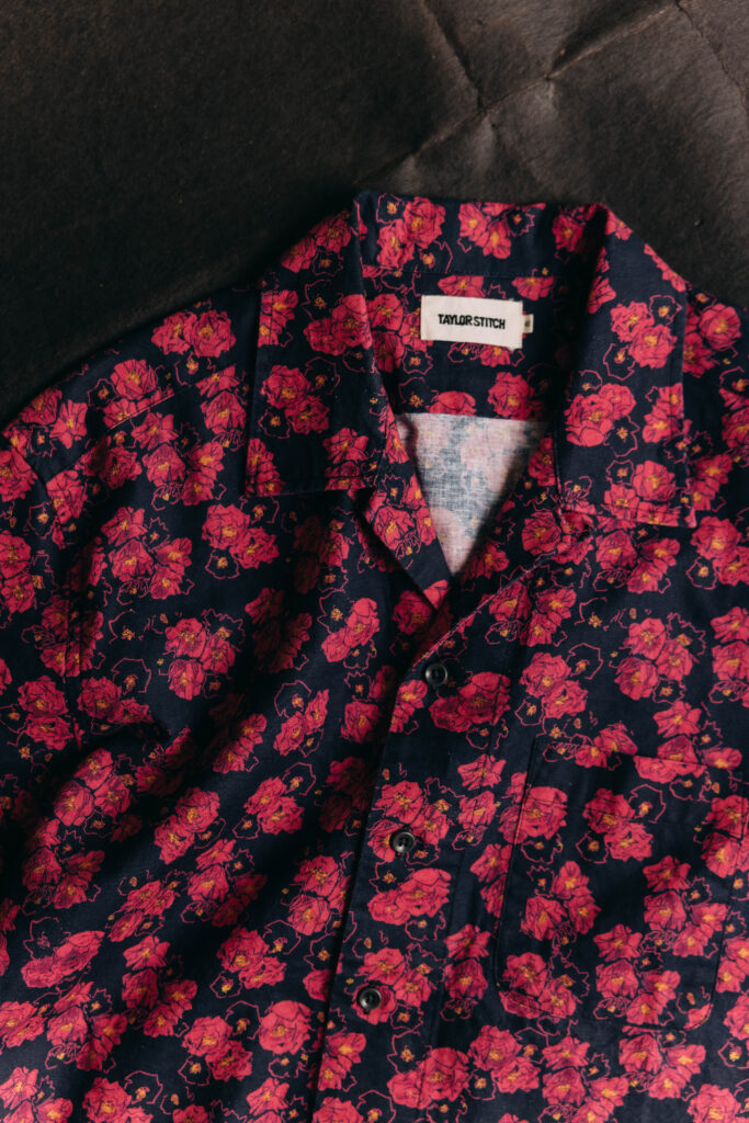
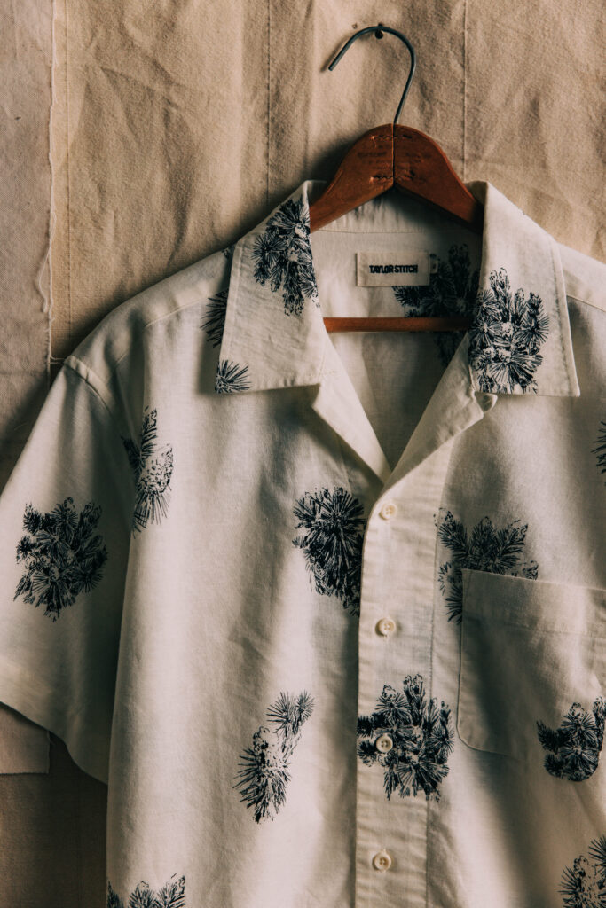
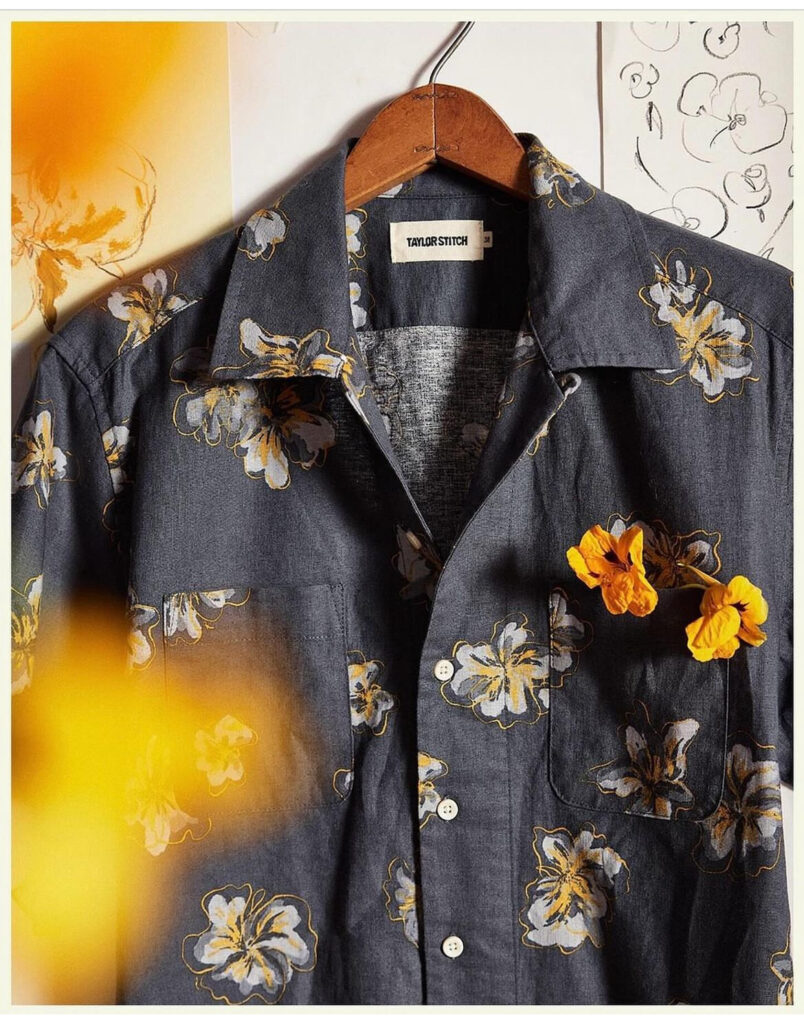
    Jimmy collaborated with Taylor Stitch to create this refined floral textile for one of the brand’s seasonal shirting collections. Blending hand-drawn illustration with understated palette work, the pattern brings a sense of organic elegance to Taylor Stitch’s rugged, heritage-driven aesthetic.

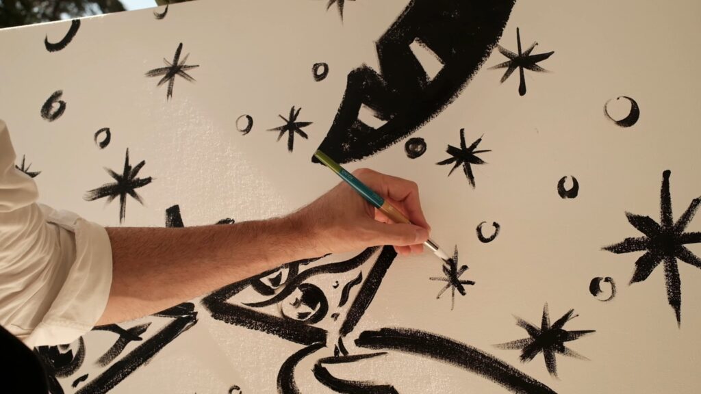
    The print features loosely sketched blossoms rendered in soft grays, muted yellows, and delicate ink outlines—each flower carrying the expressive imperfections of Jimmy’s linework. Rather than a rigid repeat, the illustration feels intentionally gestural, as if lifted straight from an artist’s studio wall. That studio atmosphere is echoed in the final presentation: the shirt photographed beside original sketches, highlighting the connection between raw concept and finished garment.

    Printed on a deep, textured indigo base, the florals add dimension without overwhelming the fabric, resulting in a shirt that feels both effortlessly wearable and thoughtfully crafted. The design strikes a balance between casual utility and art-forward detail, aligning perfectly with Taylor Stitch’s ethos of durable clothing elevated through craftsmanship.

    This collaboration showcases Jimmy’s ability to translate illustration into functional, fashion-ready textiles—bringing artistic sensitivity into everyday wardrobe staples.

  • Parea Books “The Hours Before Dusk”
  • Buck Mason — Tailoring Linework Animation

    Jimmy created this animated illustration for Buck Mason’s Instagram campaign, bringing the craftsmanship of classic menswear to life through motion. The piece features a hand-drawn suit rendered in clean, expressive linework—an homage to vintage tailoring diagrams and archival pattern books.

    As the animation unfolds, measurement marks, notations, and garment details appear one by one, as if drafted by an old-world tailor’s pen. Subtle movements—stitch lines forming, seams tracing themselves, proportions being measured—give the illustration a tactile, analog feel despite its digital execution. The pacing is deliberate and meditative, mirroring Buck Mason’s ethos of slow, intentional craftsmanship.

    The monochrome palette and minimal aesthetic place full emphasis on the artistry of construction: lapel shapes, pocket placements, shoulder lines, and fit proportions emerge with clarity and confidence. The result is a quiet yet compelling piece of branded storytelling—one that bridges heritage tailoring with modern design sensibility, all through Jimmy’s signature illustrative touch.

    Perfectly suited for social media, the animation offers a moment of visual poetry amid the scroll, reminding viewers of the beauty inherent in well-made garments.

  • Rouge Room • Red Rock, Las Vegas — Illustrated Identity & Animated Scene

    Jimmy created this expressive illustration for Rouge Room, capturing the venue’s opulent, mood-driven atmosphere through loose, gestural linework. The drawing depicts the signature circular stage framed by cascading drapery, lush potted palms, velvet textures, and an ornate ceiling fixture—evoking the glamour and intimacy of old-world lounges with a modern twist. Rendered entirely in black ink strokes, the piece feels alive with movement, as if sketched on-site during a quiet moment before showtime.

    To extend the artwork beyond the still image, Jimmy also produced an animated companion video in the same hand-drawn style. In the animation, a live band begins to play: instruments pulse, silhouettes sway, lights flicker, and the once-static room breathes to life. The animation mirrors the loose, expressive marks of the original drawing, giving the entire scene a fluid, atmospheric energy. The result is a seamless blend of illustration and motion that captures the Rouge Room’s identity—lush, theatrical, and alive with sound.

    Together, the illustration and animation form a cohesive visual language for the venue, showcasing Jimmy’s ability to translate ambience and architecture into art that moves, performs, and invites the viewer into the room.

  • Uncle Paulie’s | Tee

    Tee Design for Uncle Paulies

  • Tabula Rasa | Merch Design
  • Pestoni Family Winery Map

    Map illustration showing the vineyard locations