-
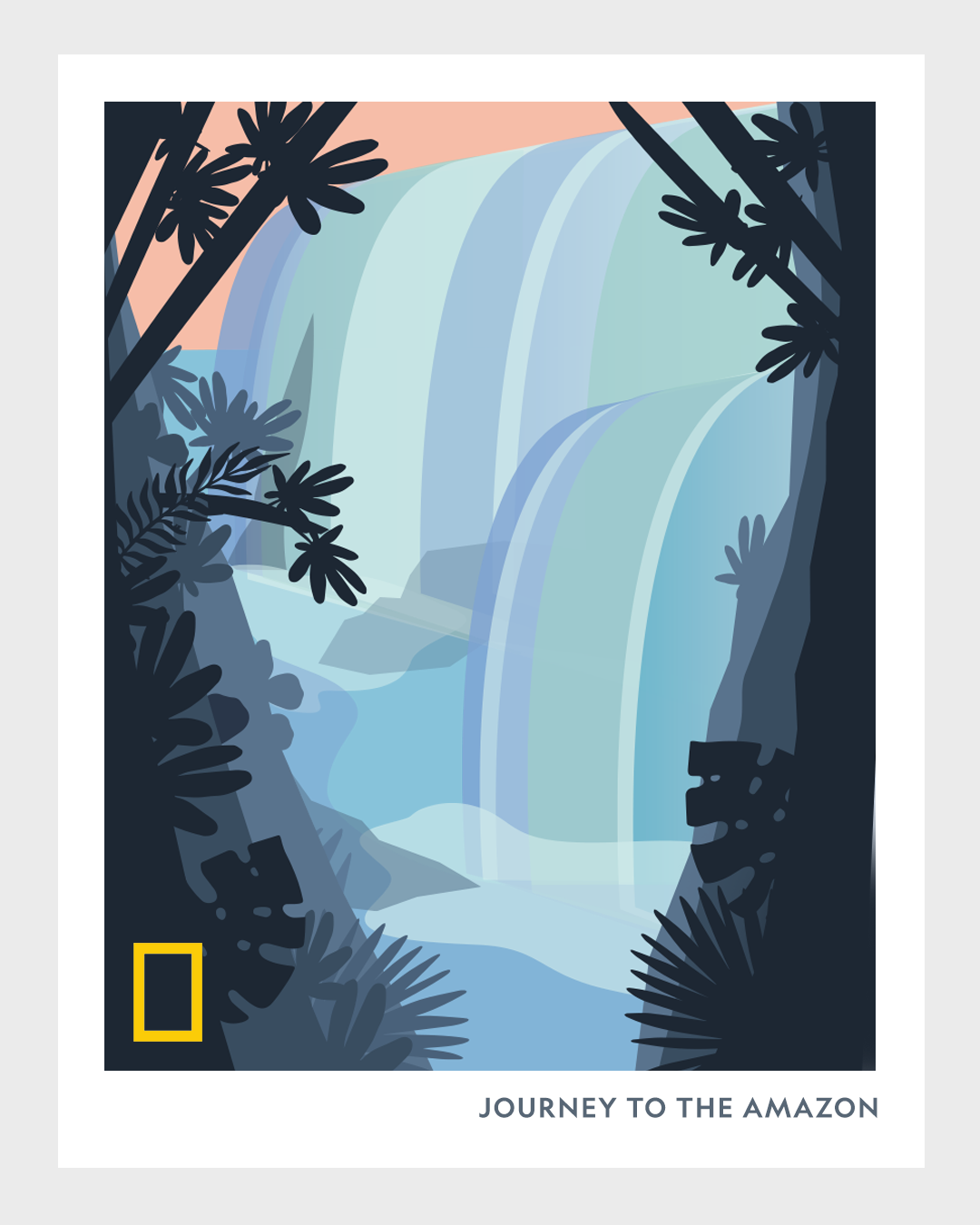
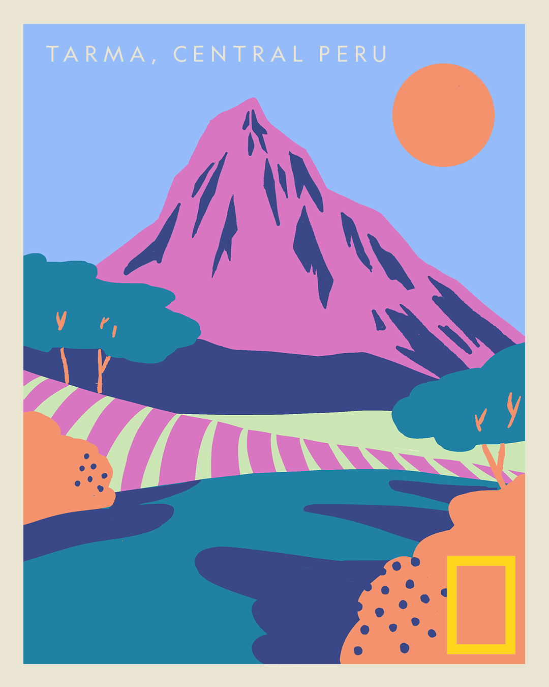
National Geographic
-
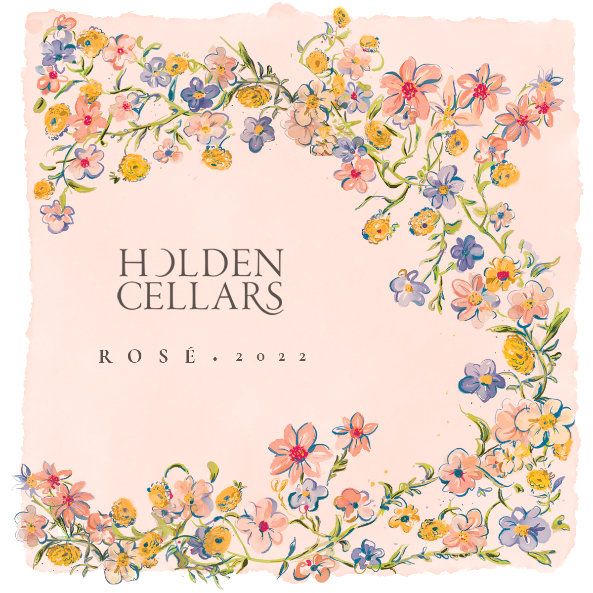
Holden Cellers Wine Label
-
National Geographic | Posters
-
GOOP – Wellness Video Suite
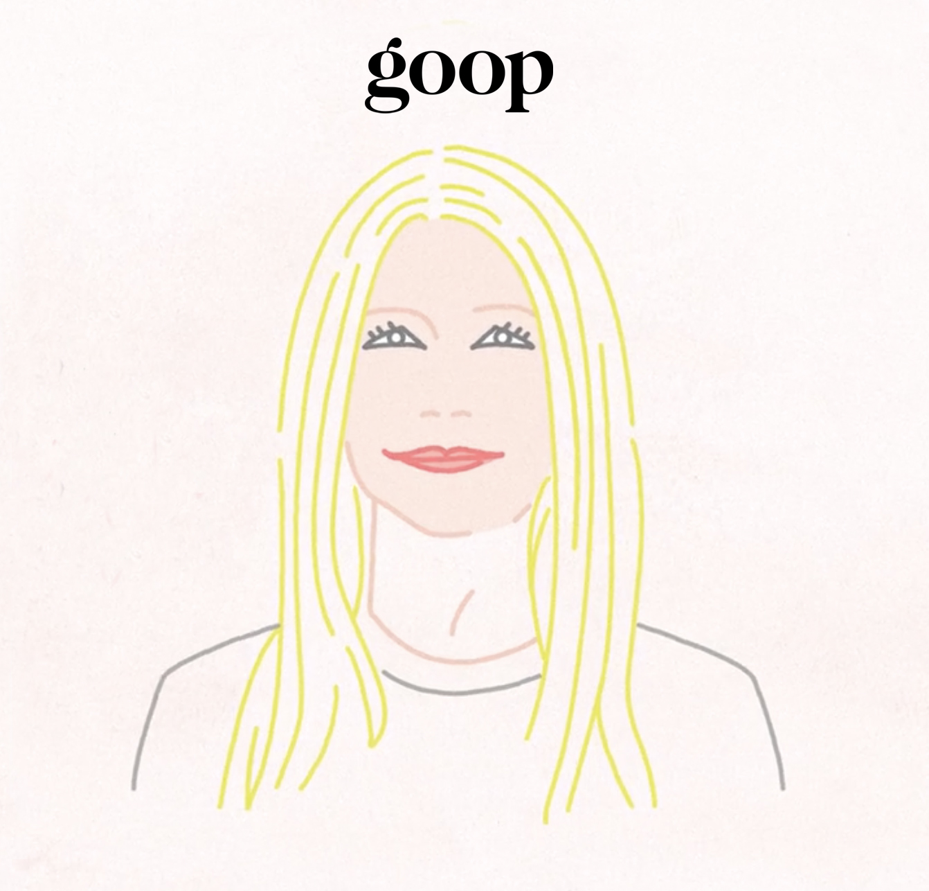
A suite of 4 wellness videos designed + directed at Brainbow
-
Star Slinger | LP Design
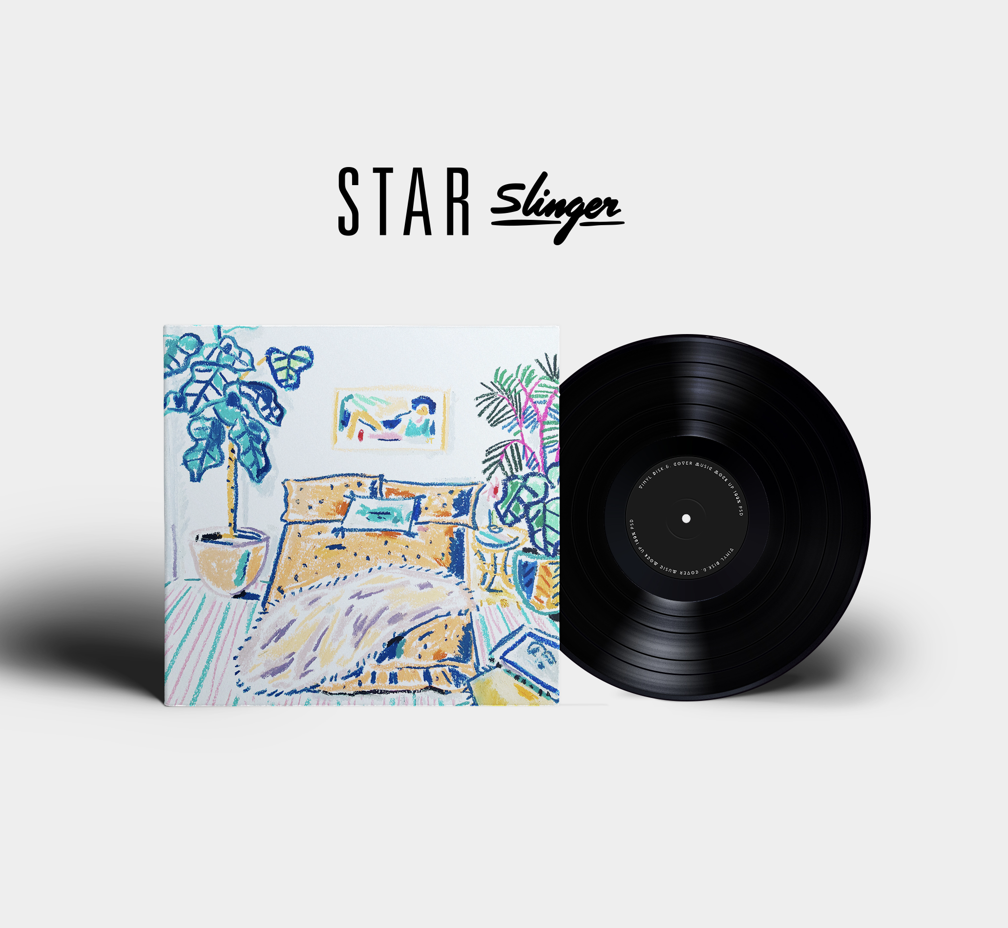
Art Direction | Illustration
-
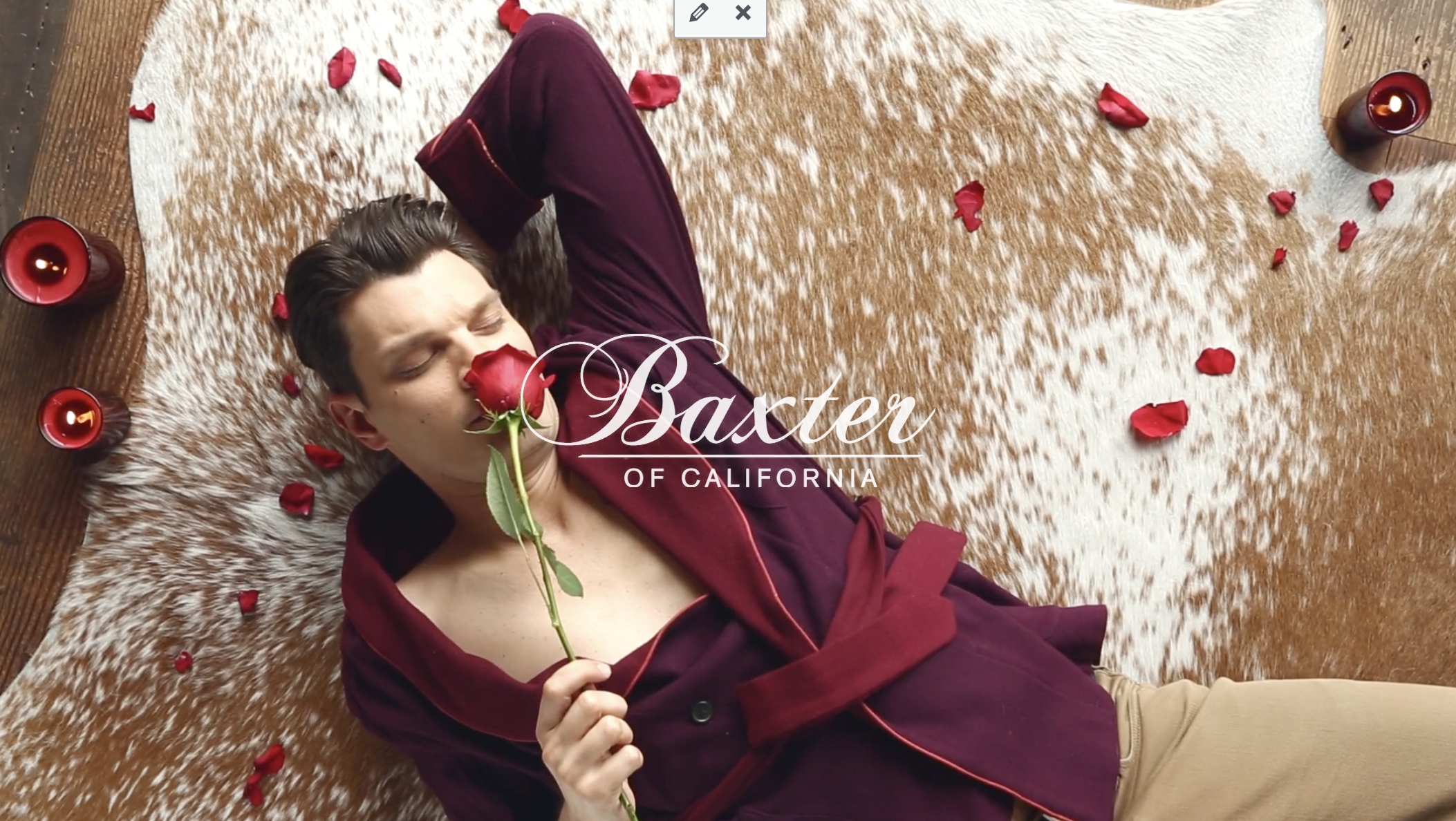
Baxter of California – Social Media Campaign
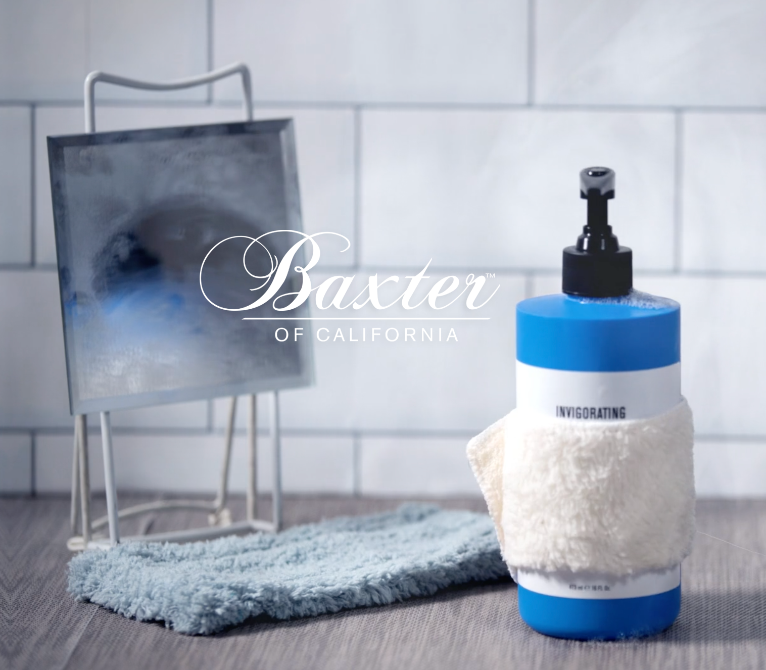
I creative directed + directed these fun stop motion product videos for Baxter of California
-
WAV | Artist Proposition Video

Loved working on this Artist onboarding video for WAV where my frames lead the way to creating the overall look and feel. The inherent eclectic nature of the app needed to translate visually. The result is a frenetic smorgasbord of styles.
-
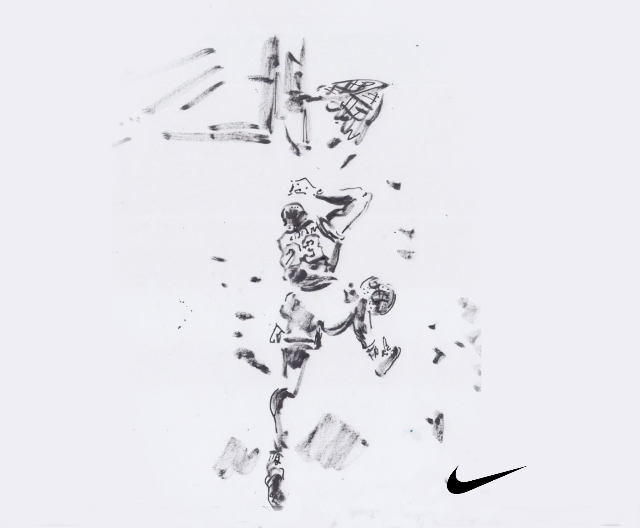
Michael Jordan | Nike spec
-
EATER’S GUIDE TO THE WORLD
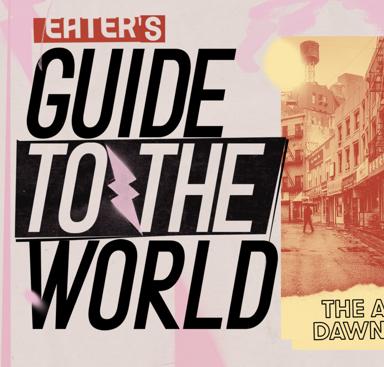
Style frames for Hulu’s original series “Eater’s Guide to the World.” Made at Brainbow
-
Baxter of California – WTF Series
I wrote, produced and directed a suite of comedic ads for Baxter of California‘s “WTF” campaign. Co-directed by Adam Greene Co-written by Ian Ghent
-
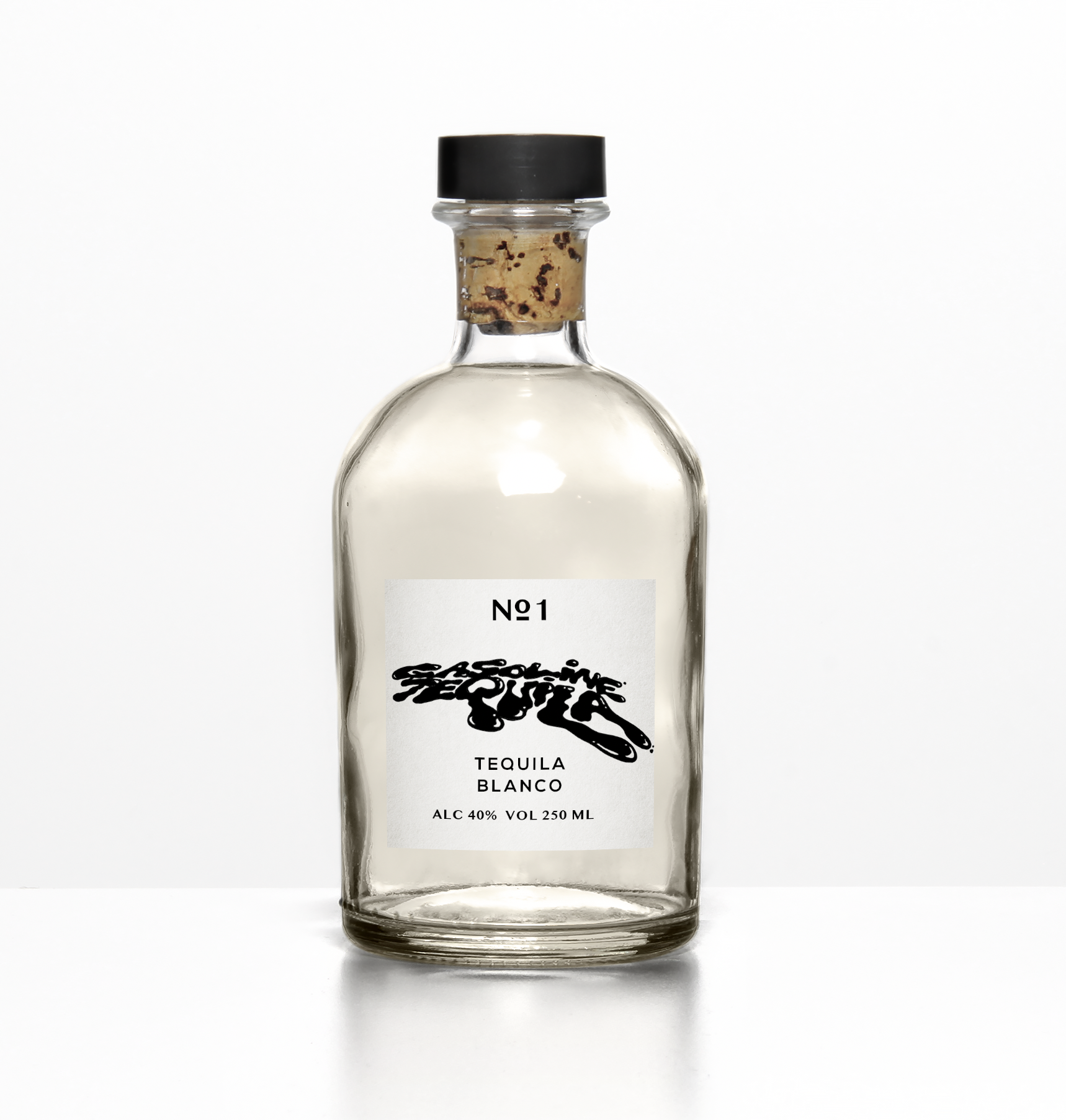
Gasoline Tequila
-
LOUP FW18 | Fashion Film
I wrote and directed this fashion film for Loup, a women’s clothing line based in NYC. This piece was set in the Hollywood Hills, as a girl who sneaks into a house. Photography: Greg Smokler Edit: Aaron Morris
-
Skyrocket

-
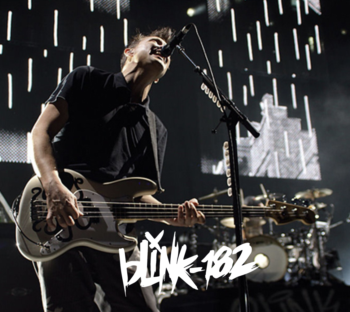
Blink 182 | Concert Visual
-
LOUP | SS 2018 FASHION FILM
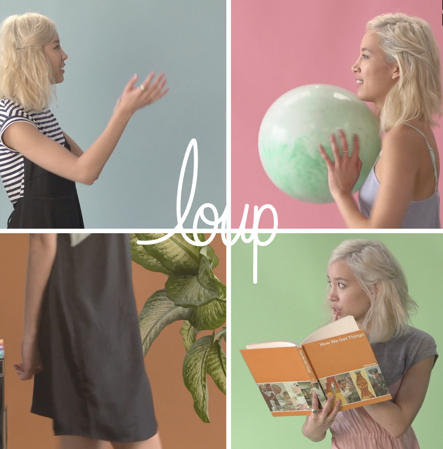
I directed and creative directed this fun split screen video for LOUP
-
Baxter – Product Videos
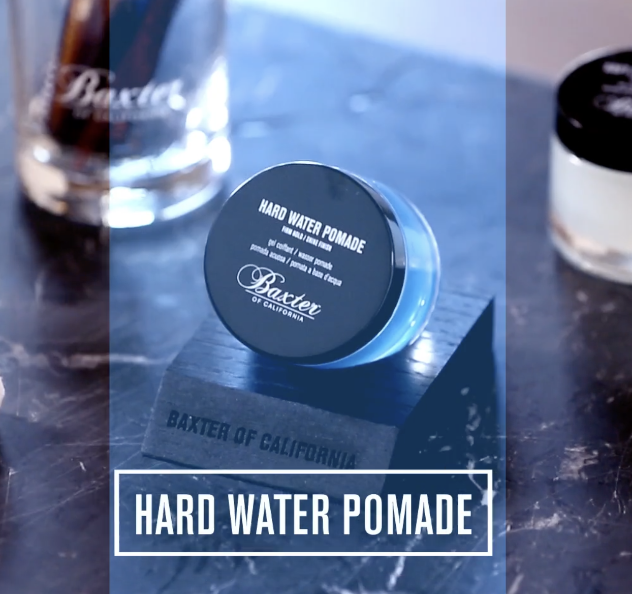
I had the opportunity to Creative Direct and Co-Direct a suite of product videos for Baxter of California. Co-Directed by Adam Greene Made at Brianbow