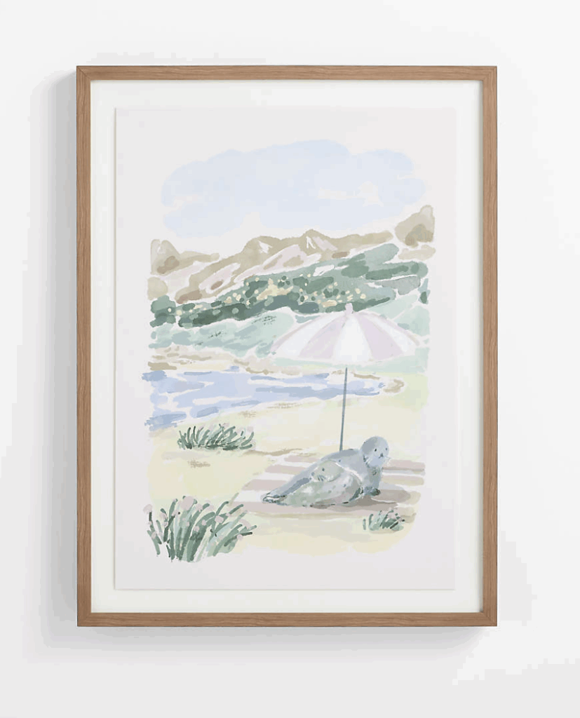
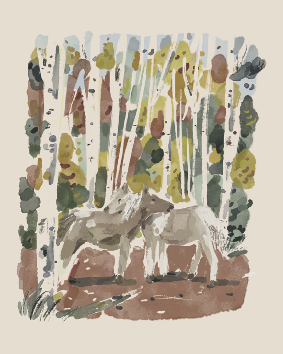
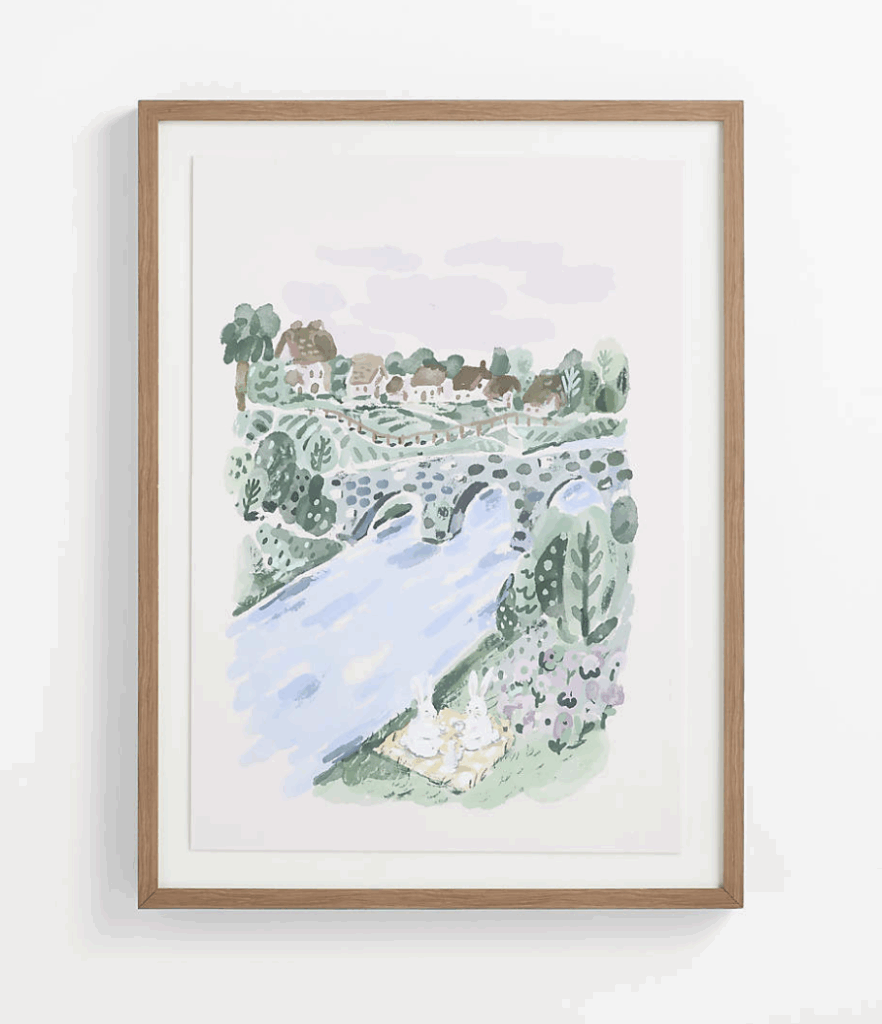
For Crate & Barrel Kids, Jimmy created a series of gentle, storybook-like landscapes that invite curiosity and quiet observation. Each illustration captures a small moment in the natural world: two horses meeting beneath a stand of birch trees, a seal resting beside a mountain lake and a pair of rabbits overlooking a river village.
Jimmy’s loose, painterly approach gives the scenes warmth and immediacy. Soft blues, mossy greens and earthy neutrals create a calming palette, while layered brushwork and small narrative details give each landscape a world of its own.
Designed as artwork for children’s spaces, the collection balances imagination with sophistication. The images feel playful without becoming overly literal, allowing them to grow with the rooms—and the children—they were created for.
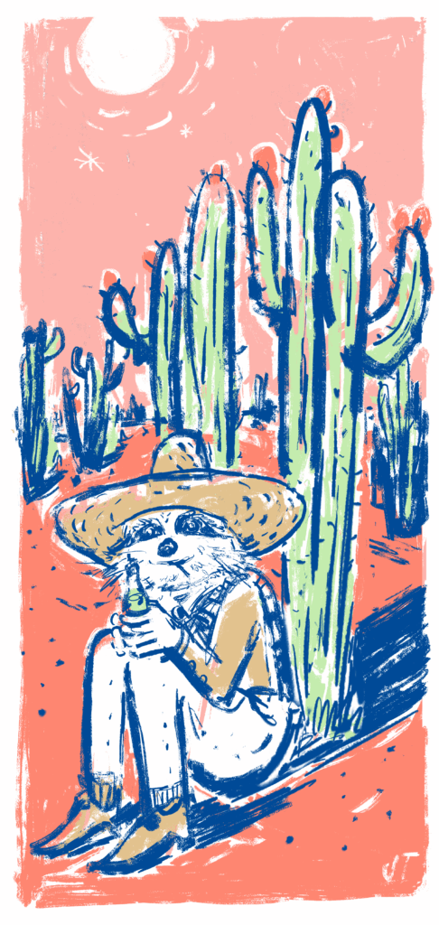
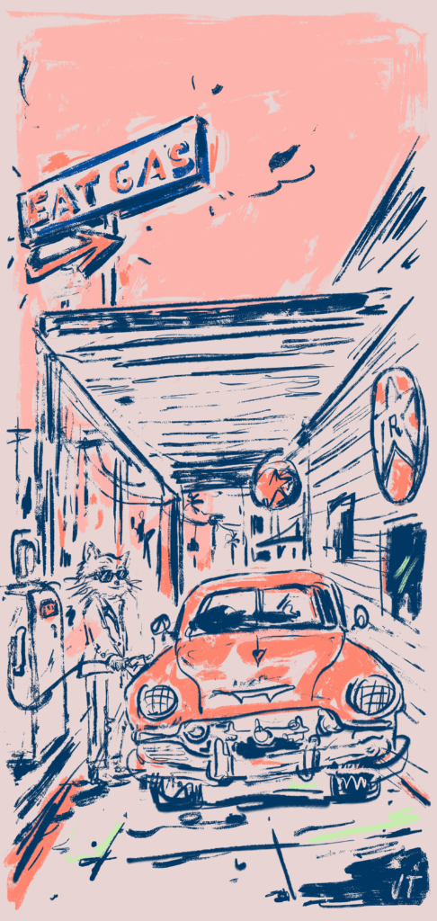
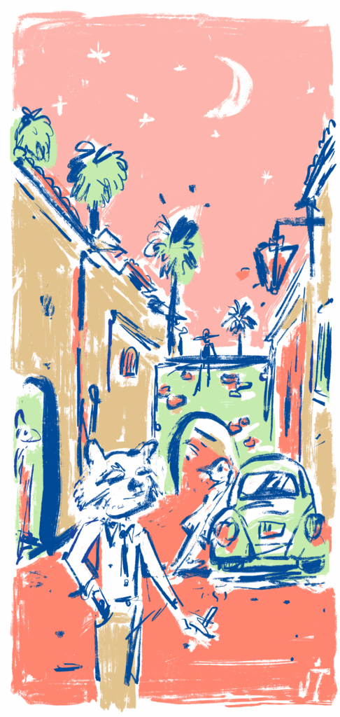
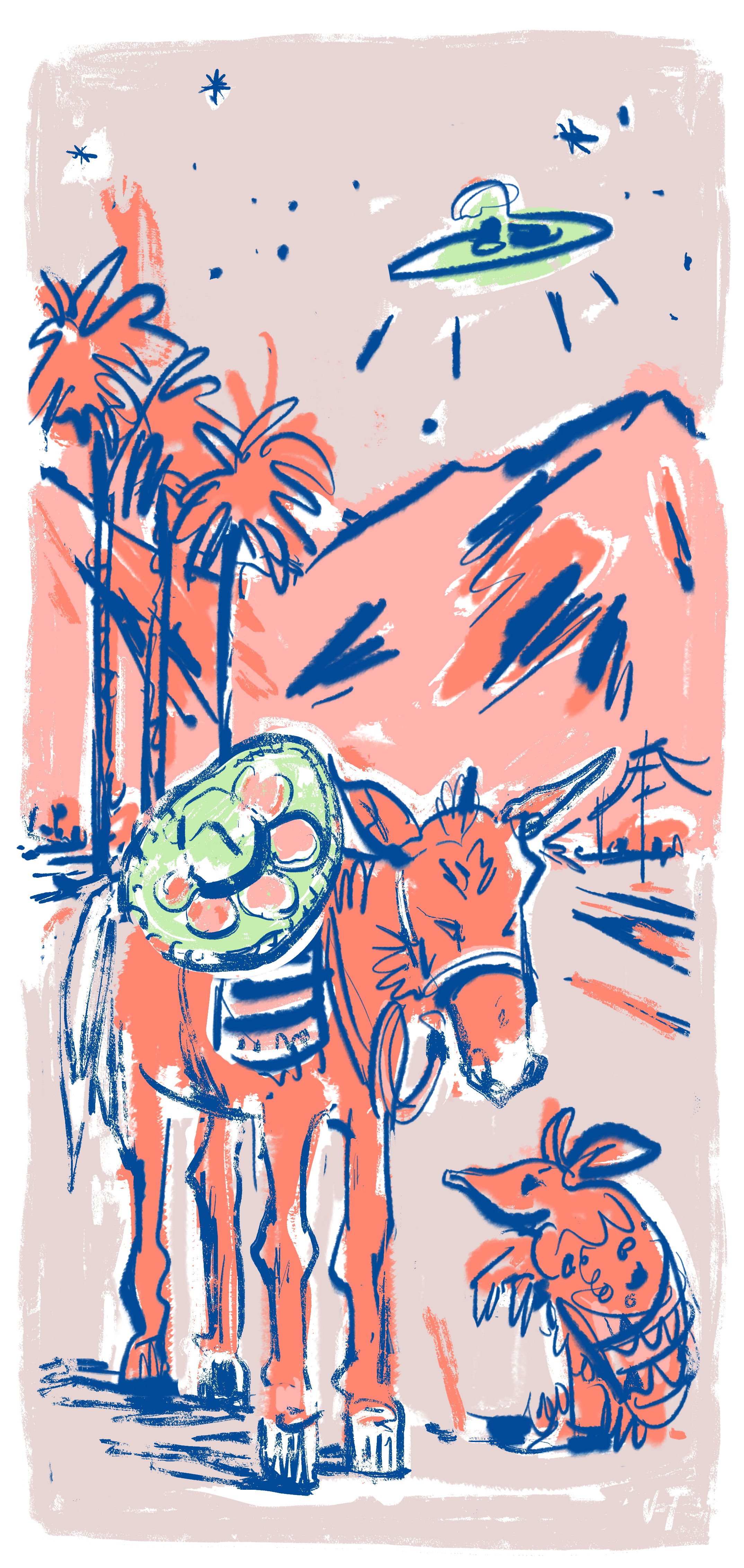
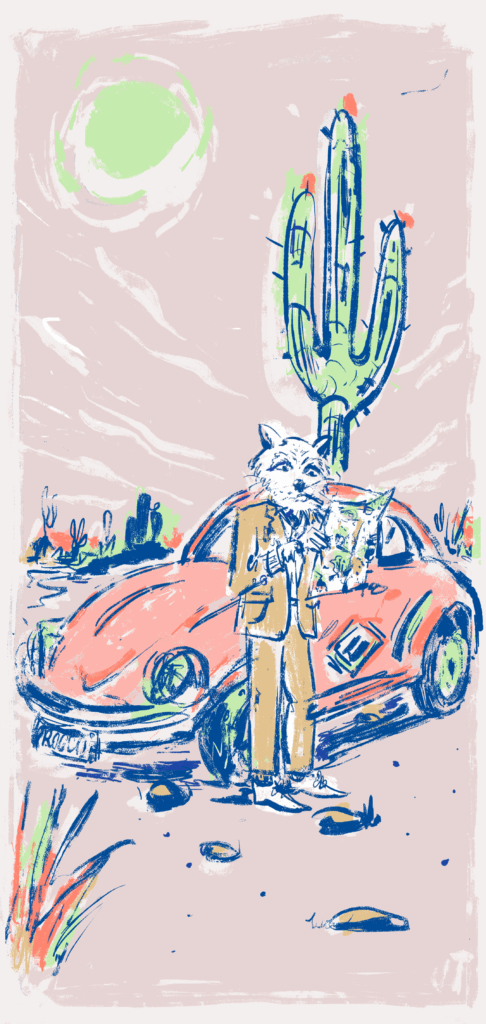
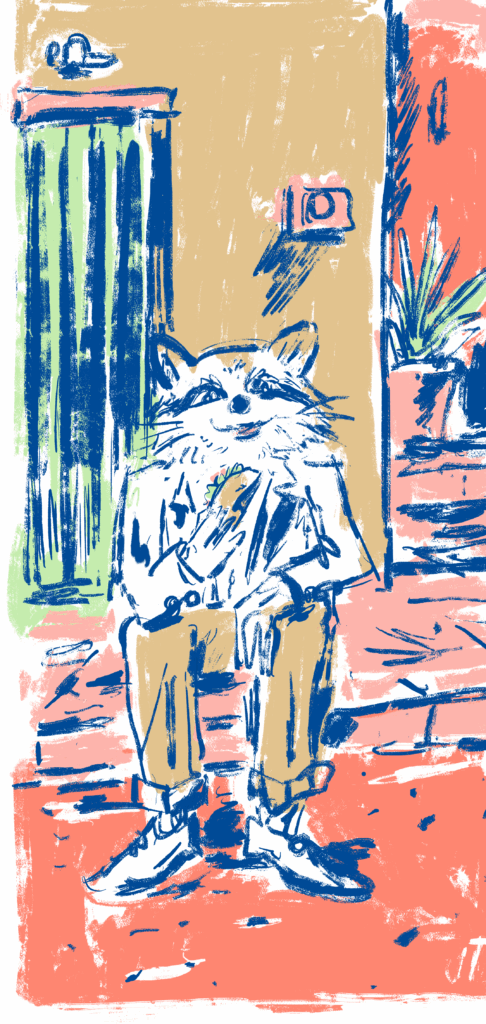
Jimmy developed the branding for Borrachito Boston as a vivid, character-driven world—playful, irreverent and rich with narrative detail. His work established the restaurant’s broader visual language, pairing energetic linework with a sun-washed palette of coral, cobalt, sand and electric green.
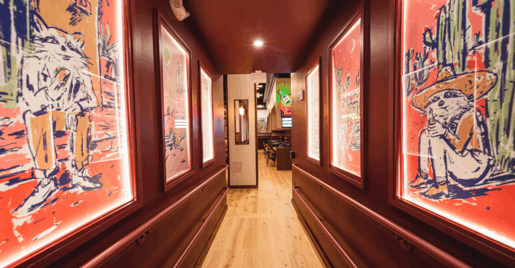
At the center of the identity is a collection of original illustrations populated by sharply dressed animals, desert wanderers, vintage cars, monumental cacti and flashes of the surreal. Drawn with the spontaneity of a travel sketchbook, the images evoke a place suspended somewhere between a roadside cantina, a nocturnal folktale and a dream of the American Southwest.
The artwork extends beyond conventional branding to become part of the architecture itself. Enlarged, illuminated illustrations line the restaurant’s corridor, transforming an ordinary passage into an immersive gallery and giving guests the sense of stepping directly into Borrachito’s imagined world.
Across the brand identity, color palette, illustrations and environmental applications, Jimmy created a cohesive visual system with wit, warmth and an unmistakable point of view—one that gives Borrachito Boston its own mythology as well as its memorable sense of place.
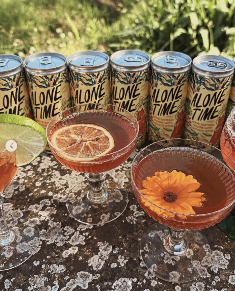
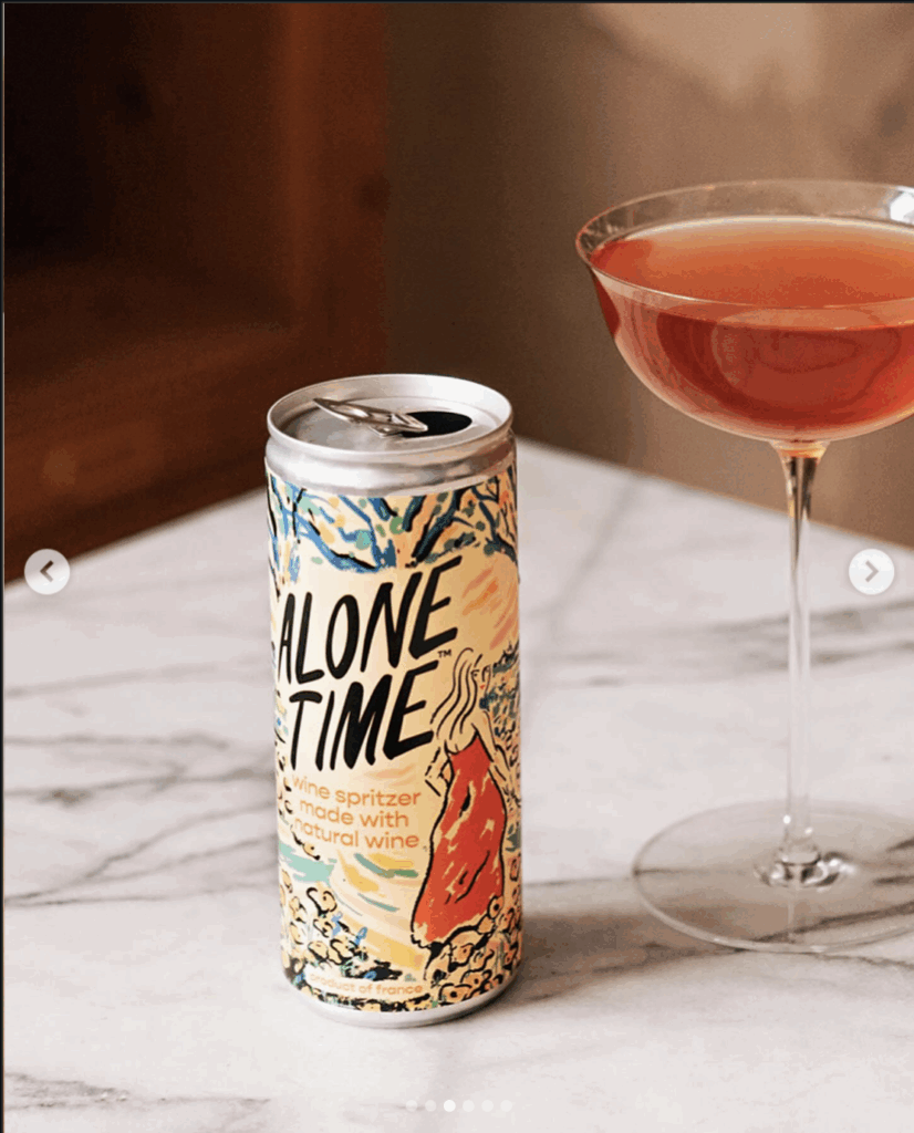
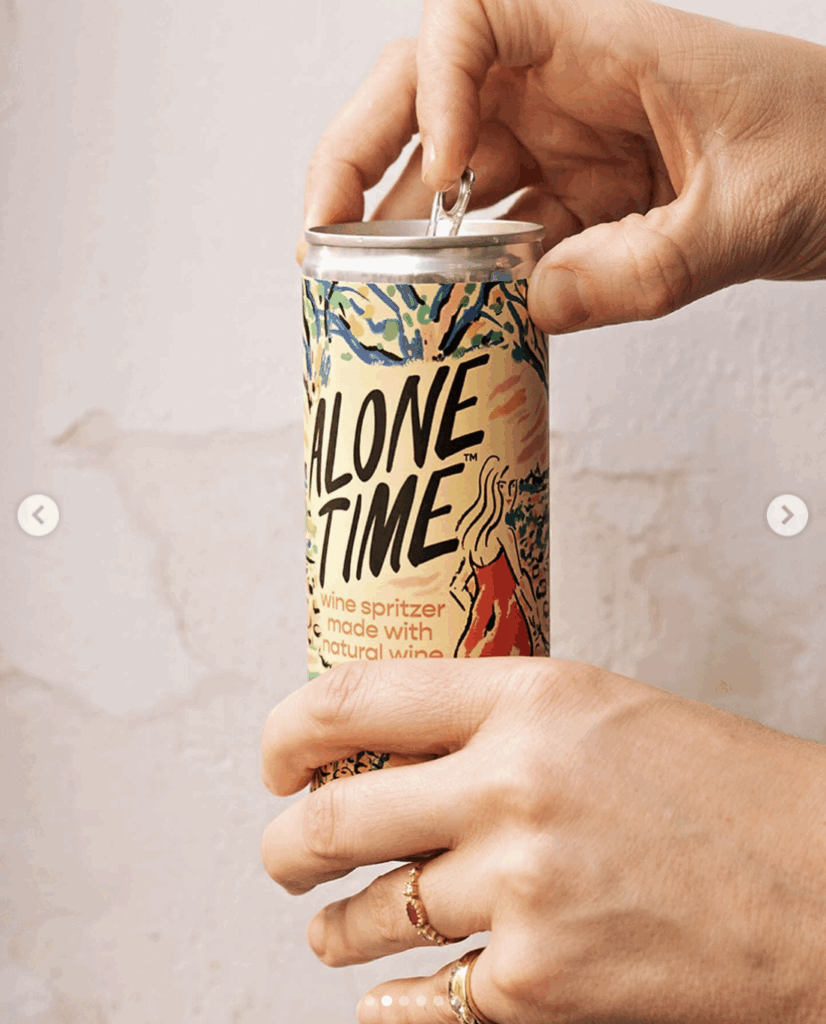
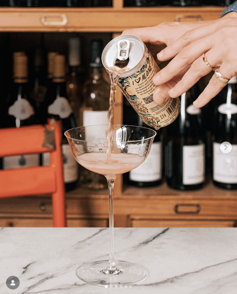
For Alone Time, Jimmy created a vibrant visual identity that captures the freedom, pleasure and slight mischief of taking a moment entirely for yourself. Designed for a natural wine spritzer, the packaging rejects the quiet restraint of traditional wine branding in favor of something immediate, expressive and full of life.
Jimmy’s hand-drawn lettering gives the name an easy confidence, while the wraparound illustration transforms the slender can into a compact work of art. Loose, energetic lines and a sun-soaked palette of yellow, coral, green and blue evoke warmth, movement and escape. The reclining figure at the center lends the design a playful intimacy, celebrating solitude as a luxury to be enjoyed.
Every surface contributes to the story, allowing the artwork to unfold as the can is turned in the hand. The result is packaging with the spontaneity of a sketchbook and the presence of a poster—distinctive on the shelf, memorable at the table and perfectly suited to a wine made for drinking on your own terms.
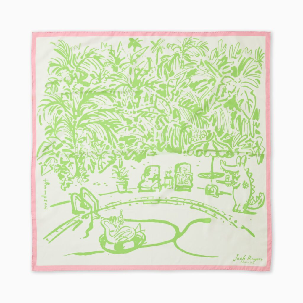
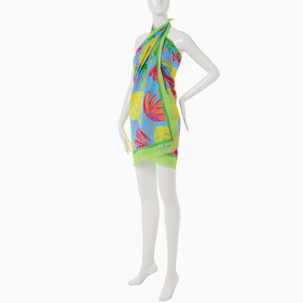
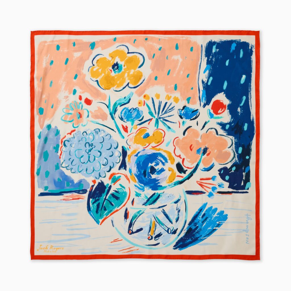
For Jack Rogers, Jimmy Thompson created a collection of illustrated scarves that brings his loose, expressive drawing style to a classic resort accessory. Each design balances the brand’s polished sensibility with a sense of spontaneity, color and humor.
One scarf imagines a lush poolside escape, rendered in crisp green against a warm ivory ground and framed in soft pink. Hidden among the palms and tropical foliage are playful details—a floating swan, a sunbather and a crocodile enjoying the scene—that reward a closer look. Another transforms an exuberant floral still life into an abstract composition of saturated blues, corals, yellows and greens.
Designed to work both as complete illustrations and as fluid textiles, the compositions shift as the scarves are folded, wrapped or worn. The result is a collection that feels at once sophisticated and carefree: wearable artwork made for long summer days, faraway places and a little bit of mischief.
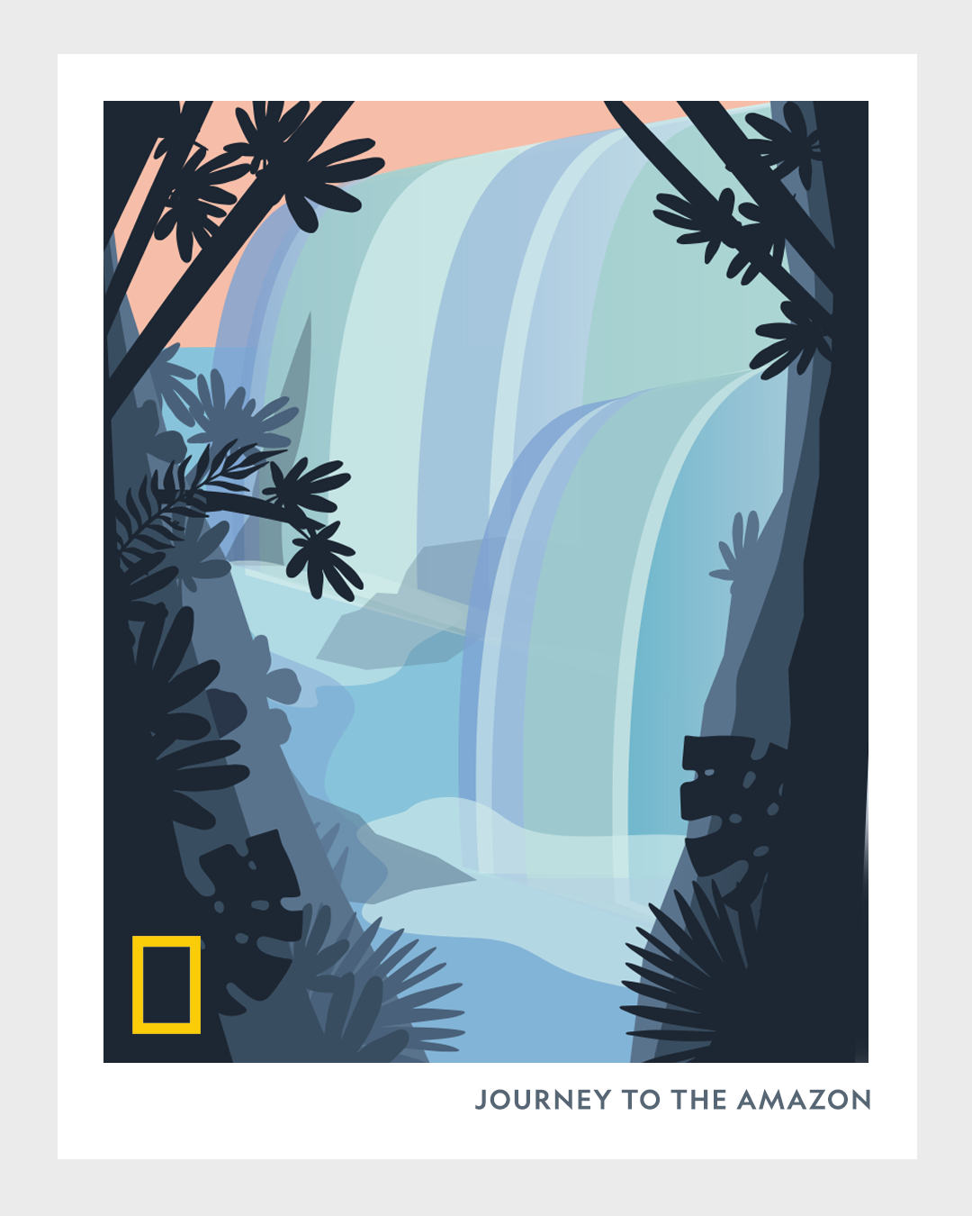
Jimmy partnered with National Geographic to create a visual series capturing the spirit of the Amazon through bold, modernist illustration. Each poster distills a different facet of the rainforest—its waterways, wildlife, waterfalls, and vast geological forms—into simplified shapes and vibrant, contemporary color palettes. The series transforms one of the world’s most complex ecosystems into a sequence of striking, graphic impressions.
Working in a style reminiscent of mid-century travel posters, Thompson reduces the Amazon’s overwhelming detail into clean vector forms, layered color fields, and atmospheric abstraction. • One composition reimagines river deltas and sediment patterns as a flowing map of organic shapes. • Another frames a winding river in deep jungle shadow, punctuated by a parrot silhouette and soft pink water that glows under the canopy. • A third spotlights a monumental waterfall rendered in cool blues, its mist and cascading planes suggested through overlapping gradients. • Others portray the region’s open waterways and horizons through bold contours and minimalist geometry.
Across the series, Thompson balances narrative clarity with artistic restraint. The work isn’t a literal documentary representation; instead, it evokes the feeling of the Amazon—humid air, dense foliage, shifting light, immense geological scale. Each piece carries the unmistakable National Geographic visual identity, enhanced by Thompson’s refined sense of color, composition, and visual storytelling.
The result is a cohesive collection of modern travel-inspired posters that invite viewers into the Amazon not through realism, but through atmosphere, mood, and design.
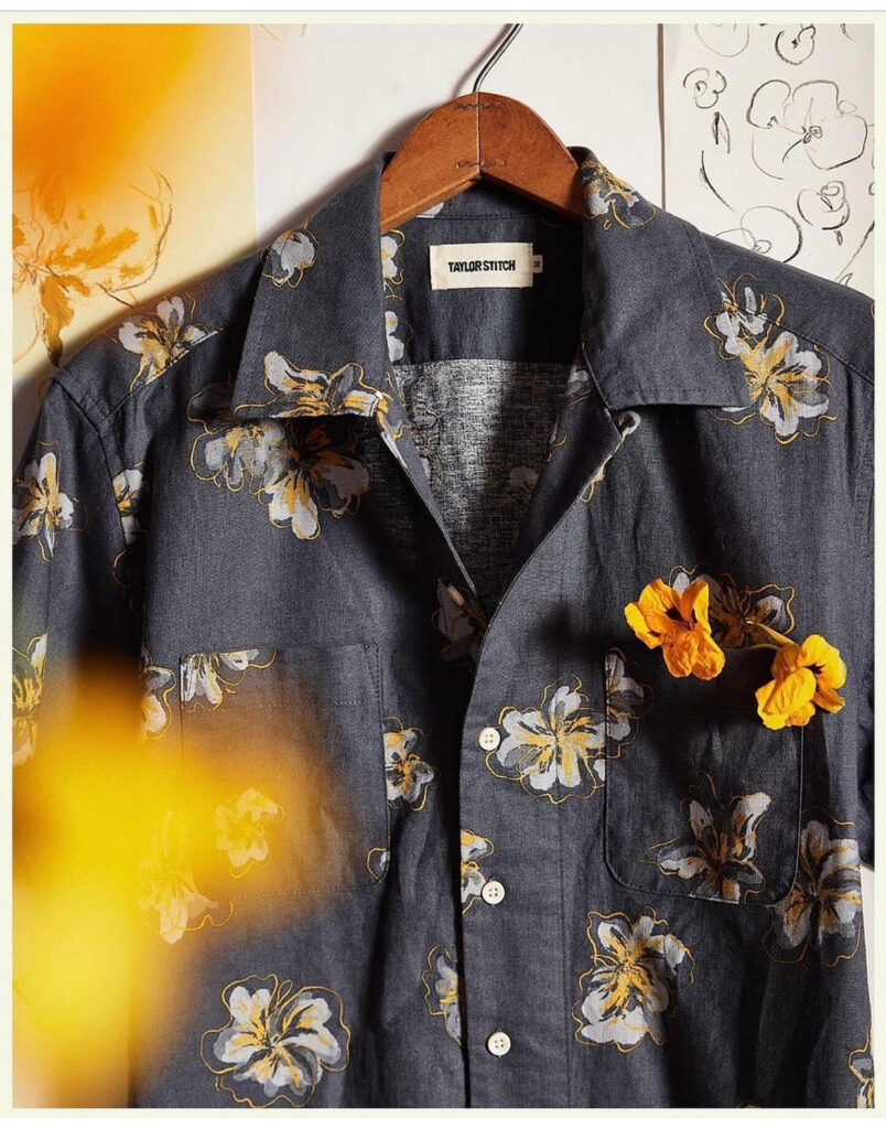
Jimmy collaborated with Taylor Stitch to create this refined floral textile for one of the brand’s seasonal shirting collections. Blending hand-drawn illustration with understated palette work, the pattern brings a sense of organic elegance to Taylor Stitch’s rugged, heritage-driven aesthetic.
The print features loosely sketched blossoms rendered in soft grays, muted yellows, and delicate ink outlines—each flower carrying the expressive imperfections of Jimmy’s linework. Rather than a rigid repeat, the illustration feels intentionally gestural, as if lifted straight from an artist’s studio wall. That studio atmosphere is echoed in the final presentation: the shirt photographed beside original sketches, highlighting the connection between raw concept and finished garment.
Printed on a deep, textured indigo base, the florals add dimension without overwhelming the fabric, resulting in a shirt that feels both effortlessly wearable and thoughtfully crafted. The design strikes a balance between casual utility and art-forward detail, aligning perfectly with Taylor Stitch’s ethos of durable clothing elevated through craftsmanship.
This collaboration showcases Jimmy’s ability to translate illustration into functional, fashion-ready textiles—bringing artistic sensitivity into everyday wardrobe staples.
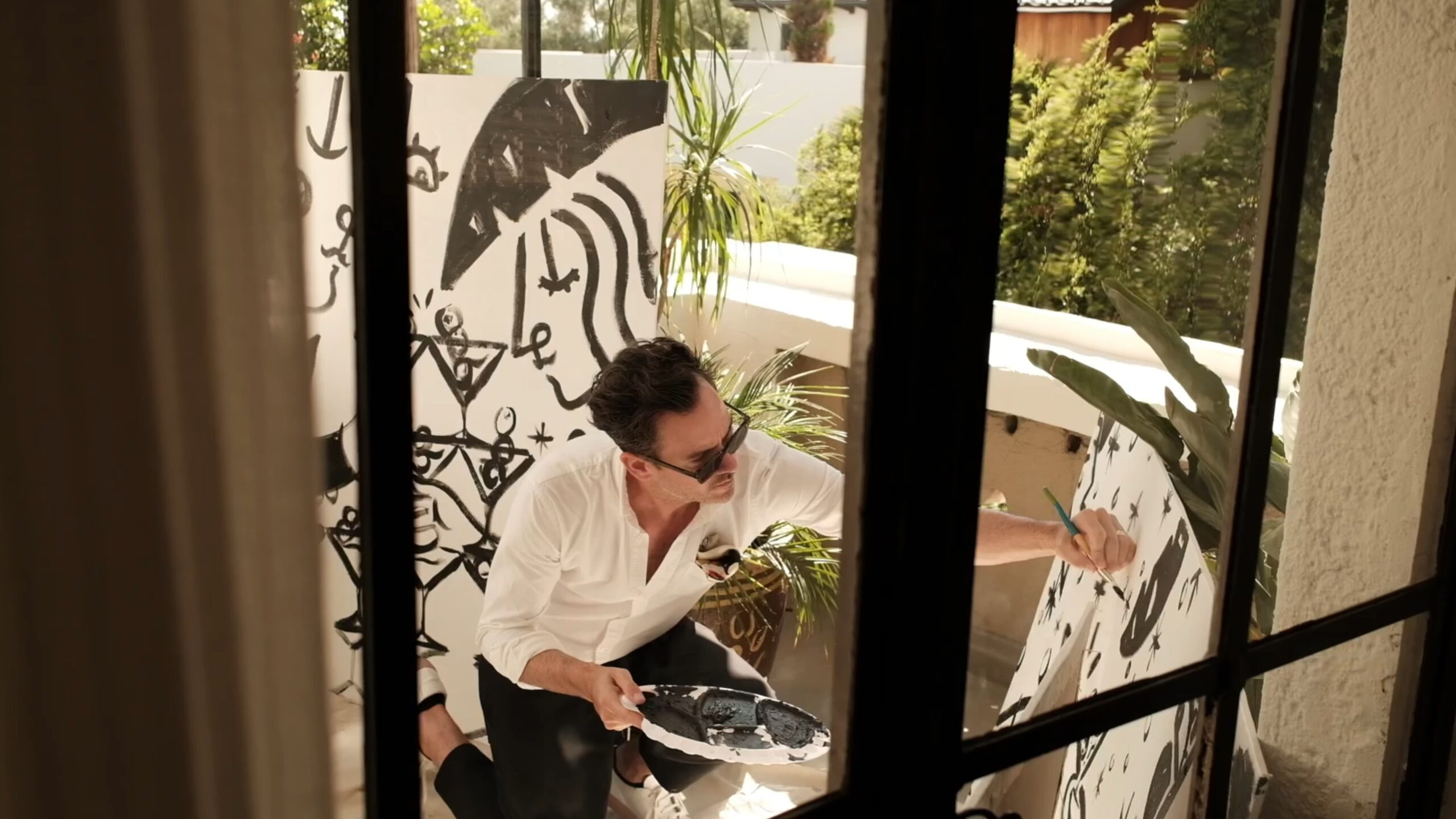
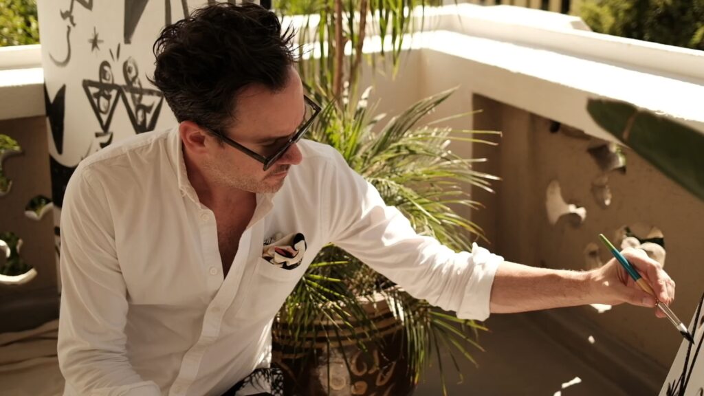
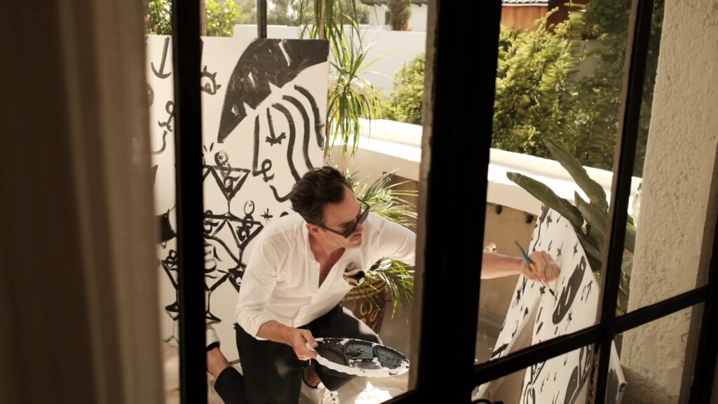
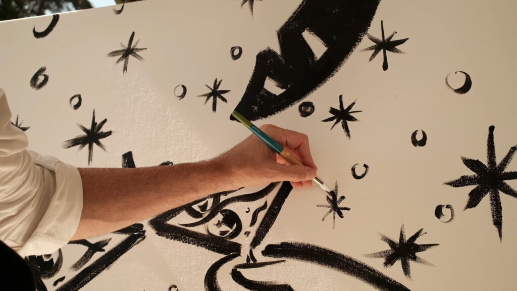
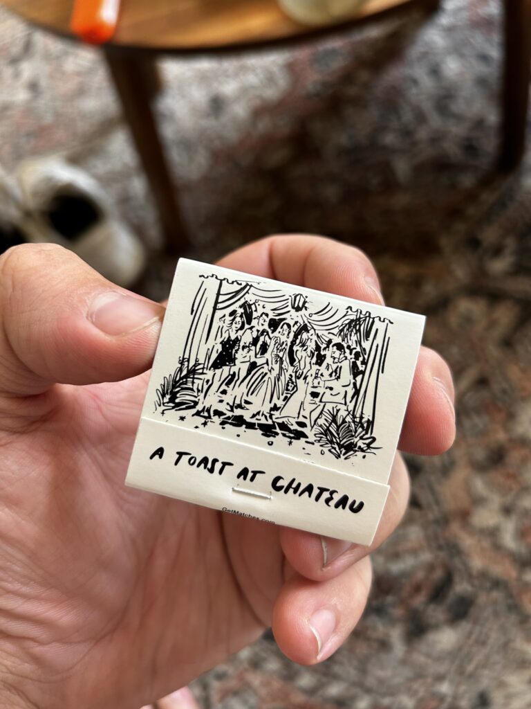
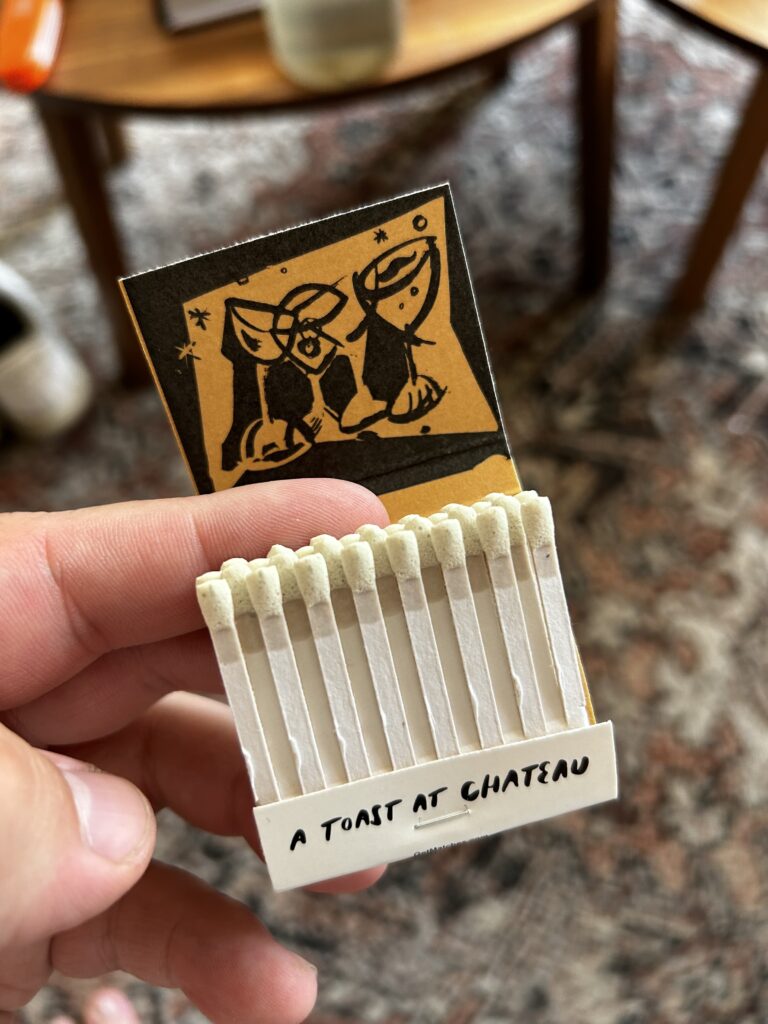
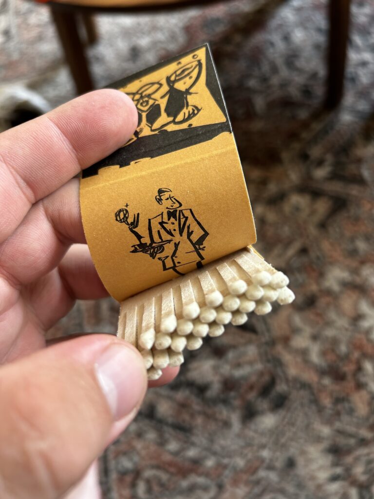
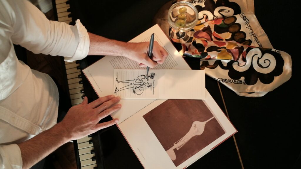
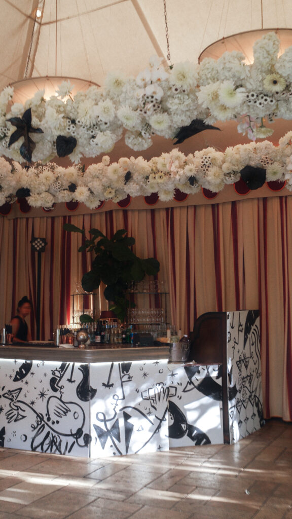
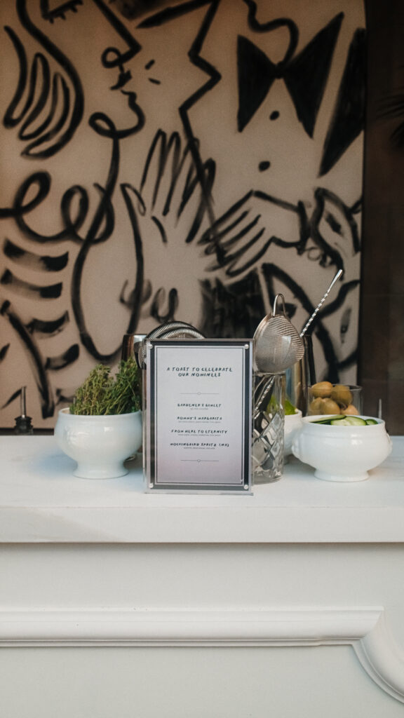
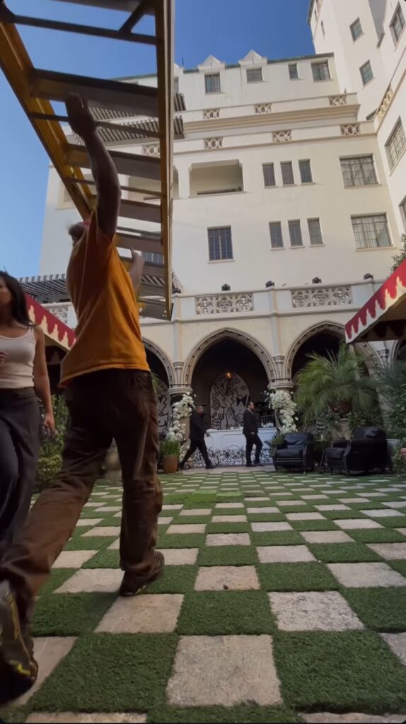
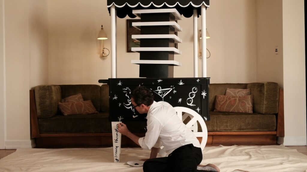
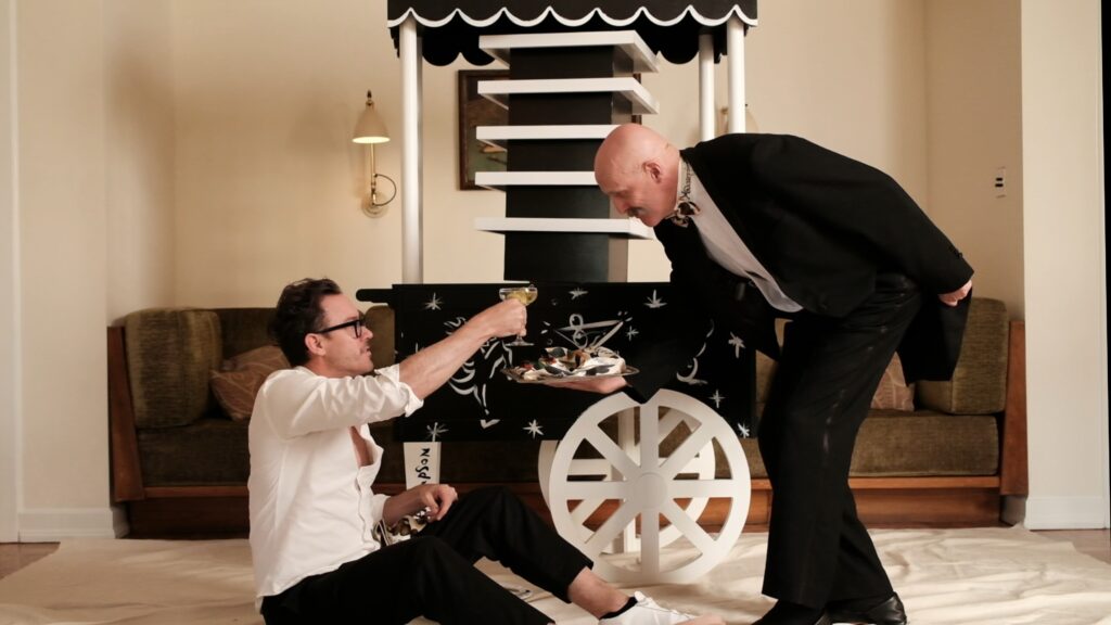
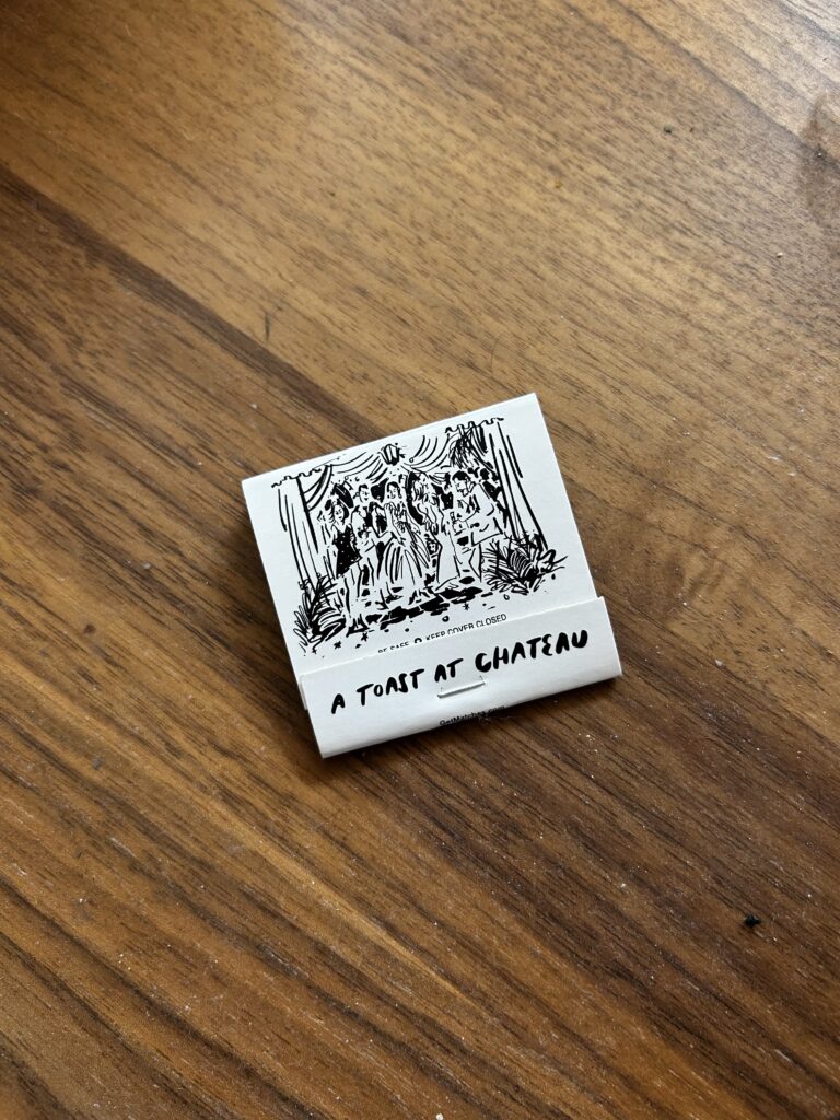
For the 2024 Emmy’s celebration at Chateau Marmont, Jimmy brought his signature line work to life across an immersive series of custom artworks. He hand-painted large-scale backdrops, bar panels, and decor with bold, gestural illustrations that set a playful, cinematic tone for the event. Guests were greeted with bespoke matchbooks and live drawing, where Jimmy sketched portraits and scenes in real time, turning the piano into a living studio. This collaboration merged fine art and hospitality, capturing the glamour and spontaneity of Hollywood’s awards season.
Client: The Georgian Hotel, Santa Monica | Project: Illustrations & Brand Collateral
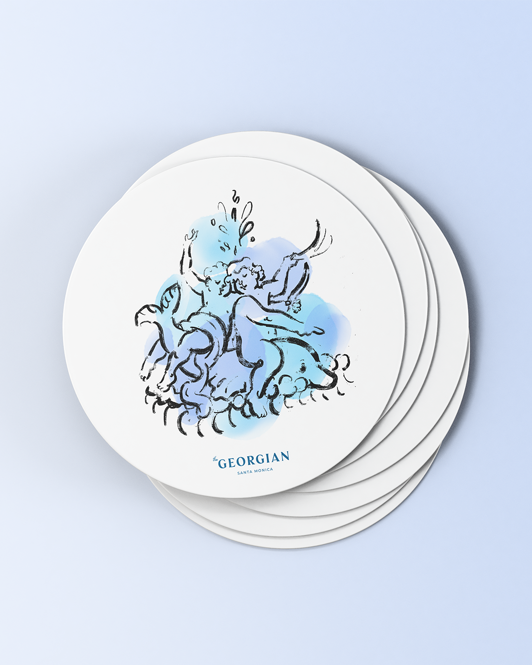
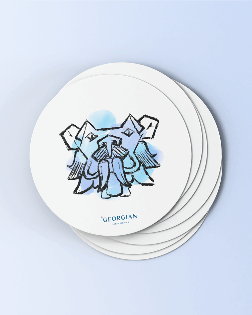
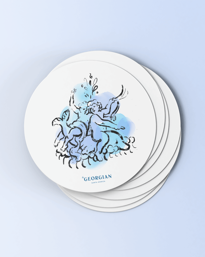
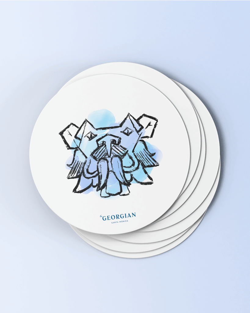
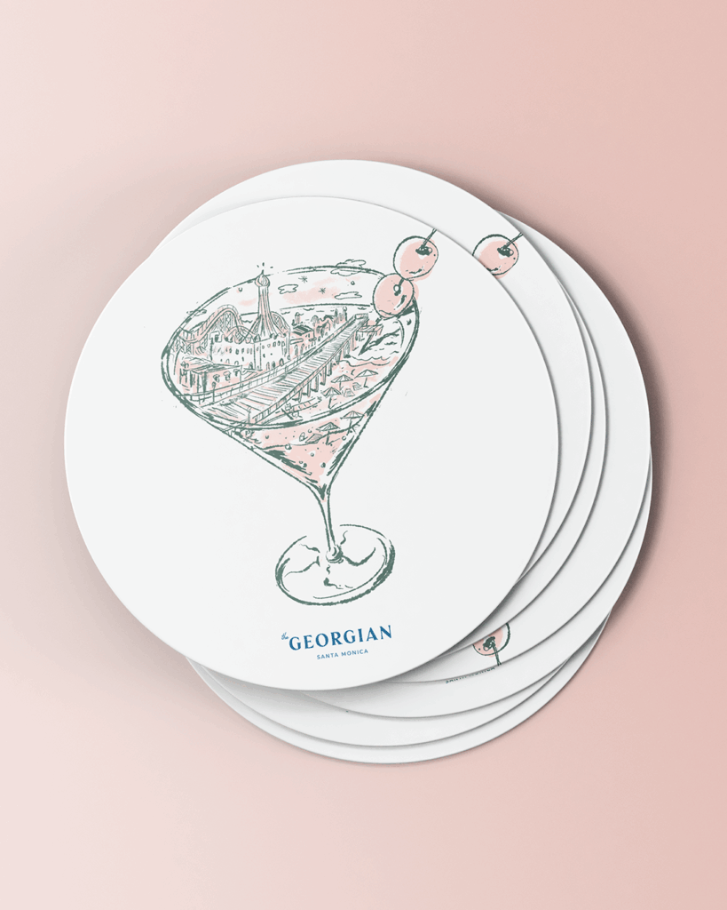
Jimmy partnered with The Georgian, Santa Monica’s iconic Art Deco hotel, to create a collection of bespoke illustrations that celebrate the property’s history, architecture, and timeless glamour. Known as the “First Lady of Santa Monica,” The Georgian carries with it a rich legacy of Hollywood allure and coastal elegance—a story Thompson translated into visual form.
For this project, he developed a series of hand-drawn illustrations infused with watercolor washes, merging architectural detail with playful nostalgia. Subjects include the hotel’s lion gargoyles, vintage telephones, and mythic cherubs, each reinterpreted through Thompson’s expressive linework and light washes of color.
These illustrations were applied to a variety of brand elements, most notably:
Custom Coasters – featuring rotating illustrations, offering guests an intimate connection to the hotel’s character.
Decorative Touchpoints – imagery integrated throughout the property’s printed collateral, reinforcing the brand’s narrative.
Art-Inspired Branding – extending the hotel’s legacy as an artistic and cultural landmark into its everyday guest experience.
The collaboration reflects Thompson’s ability to honor history while making it feel fresh and contemporary. His work for The Georgian communicates:
Heritage – capturing the grandeur of the Art Deco period with nods to the building’s historic details.
Whimsy – infusing personality and charm into objects and motifs that might otherwise be overlooked.
Luxury Storytelling – creating art that elevates guest experience and deepens their sense of place.
Through this project, Jimmy Thompson demonstrated his talent for aligning illustration with hospitality branding, helping The Georgian deliver not just a stay, but a storied experience that celebrates Santa Monica’s coastal legacy.
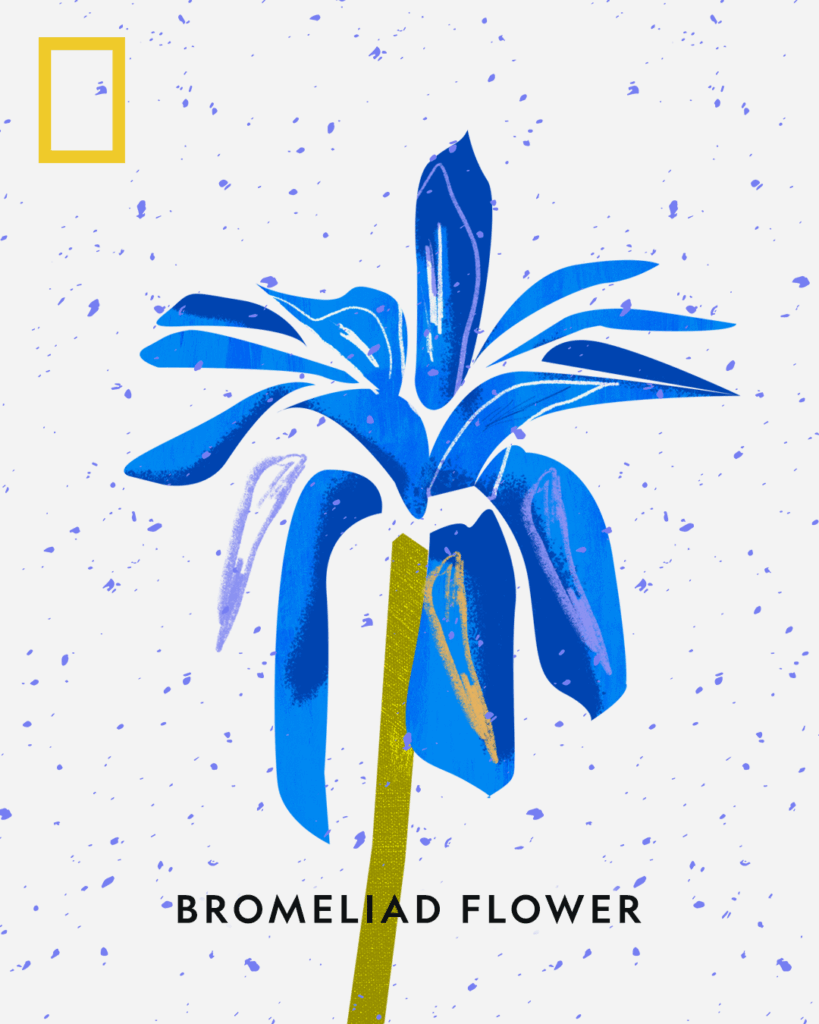
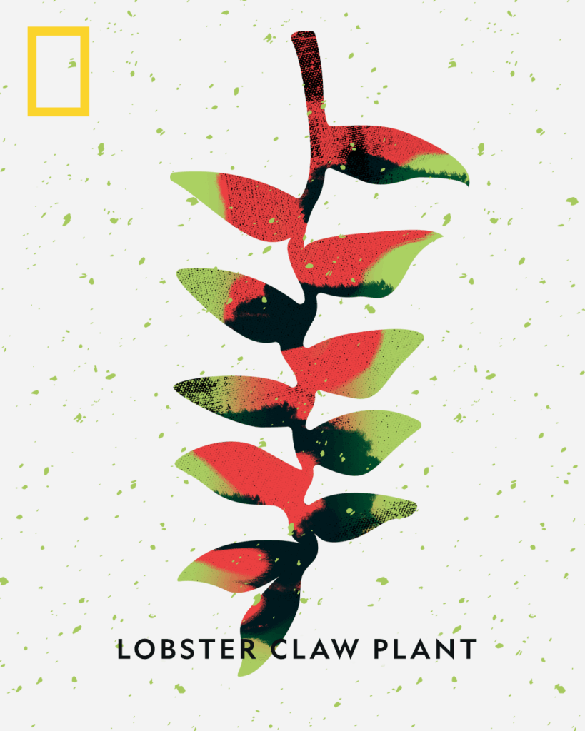
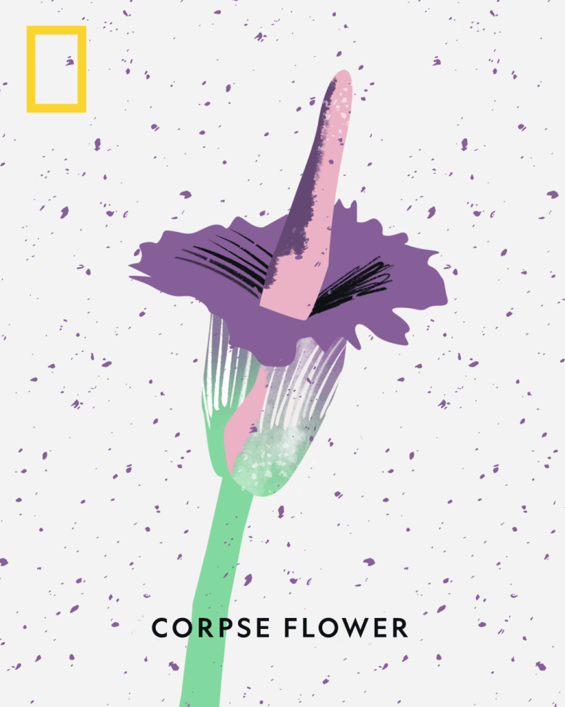
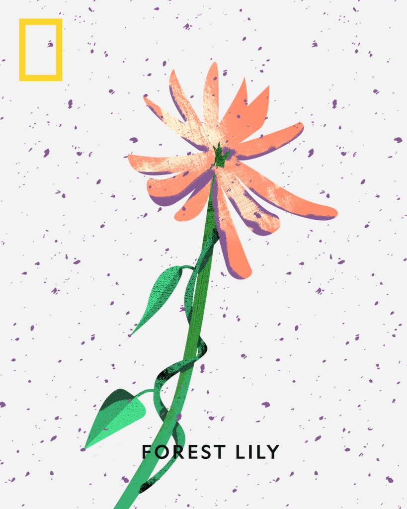
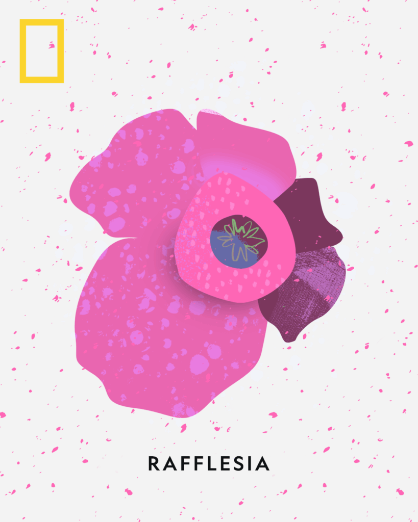
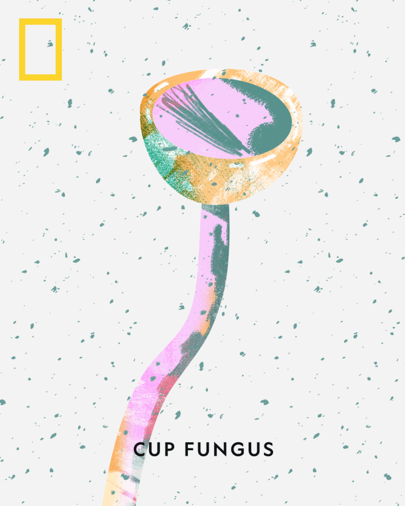
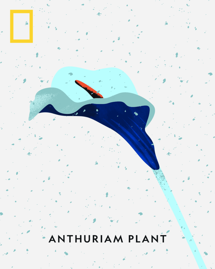
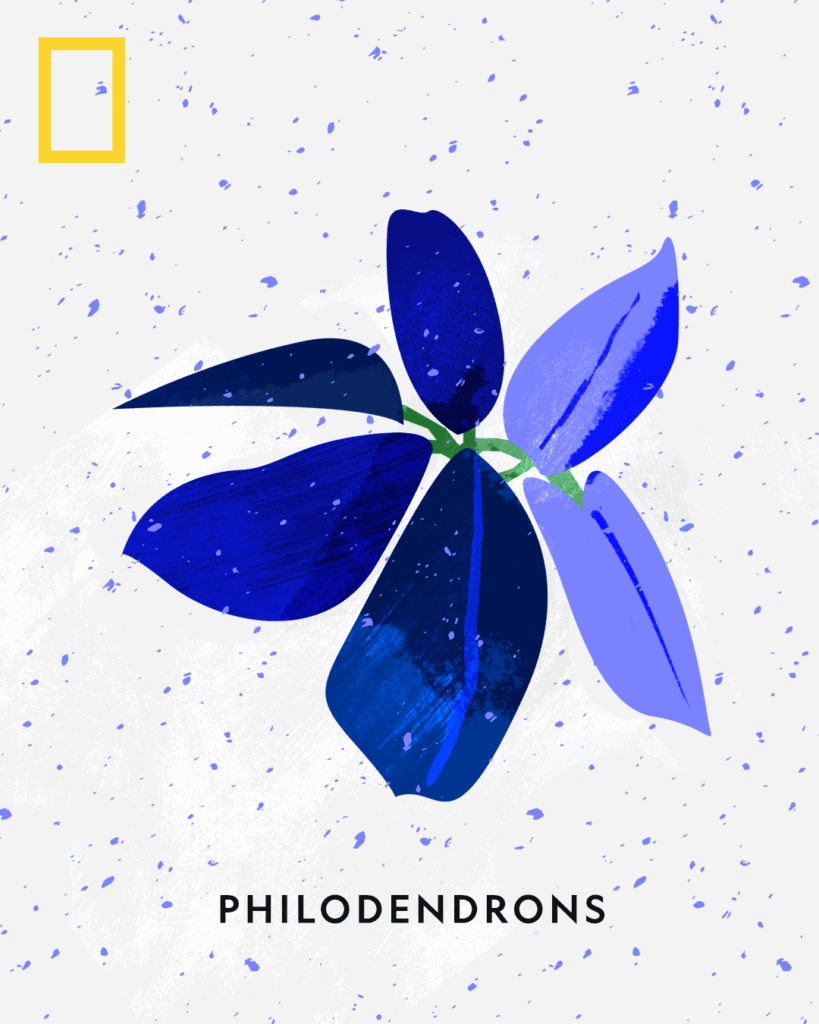
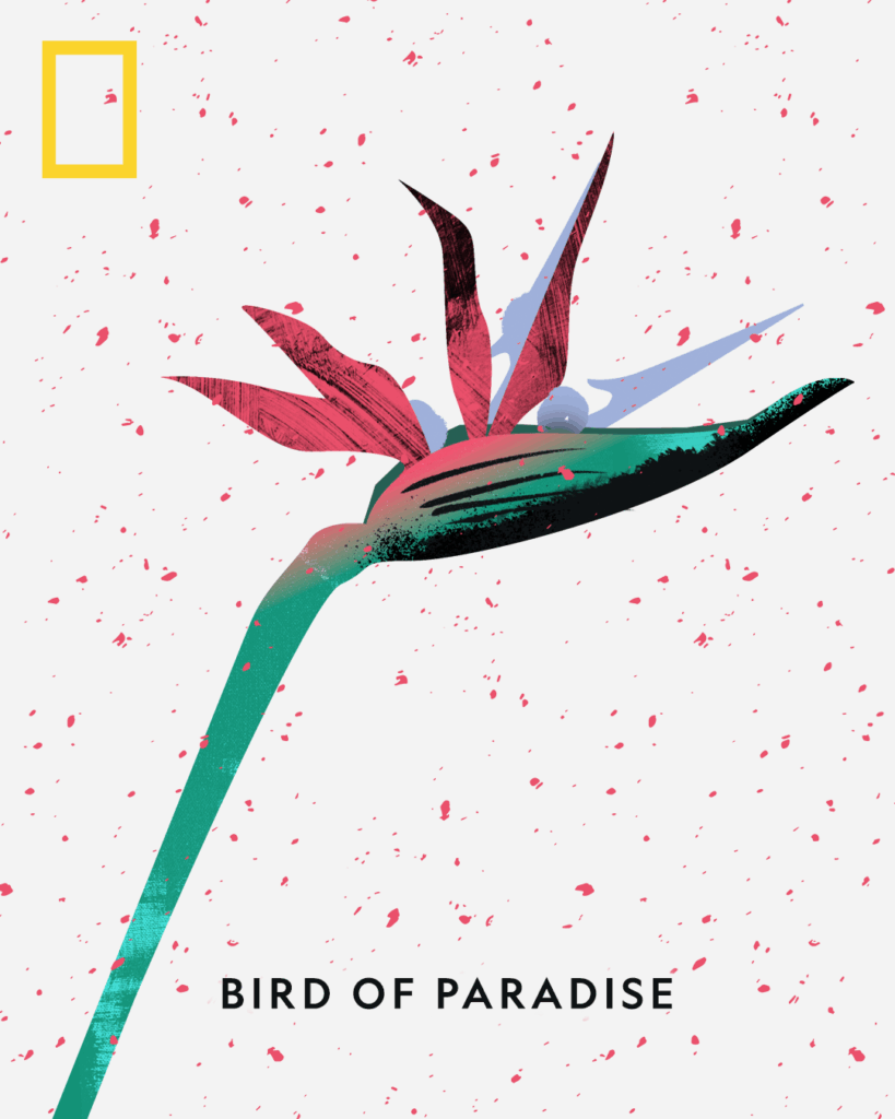
For National Geographic’s Flowers Collection, Jimmy created a vibrant series of botanical illustrations that reinterpret the natural world through bold color palettes, abstract textures, and contemporary form.
This series includes iconic species such as the Forest Lily, Bromeliad Flower, Lobster Claw Plant, Corpse Flower, Rafflesia, Cup Fungus, Anthurium, Philodendrons, and Bird of Paradise. Each artwork transforms the familiar into something newly striking—balancing scientific accuracy with artistic imagination.
Thompson’s process blends digital painting with traditional printmaking aesthetics, giving the works a tactile, layered feel that resonates with both editorial storytelling and gallery settings. His approach emphasizes clarity, curiosity, and wonder, aligning seamlessly with National Geographic’s mission to illuminate and inspire connections with the natural world.
The Flowers Collection stands as a testament to Thompson’s ability to adapt his visual language for cultural institutions and global audiences. It demonstrates his strength in:
Scientific storytelling through art – interpreting biological subjects with precision and accessibility.
Bold visual experimentation – using unexpected colorways and textures to reframe perception.
Client collaboration – delivering a suite of cohesive works that support National Geographic’s brand identity and editorial excellence.
With this project, Jimmy Thompson reaffirms his role as a visual interpreter of nature—an artist capable of translating the complexity and beauty of the living world into iconic, memorable design.
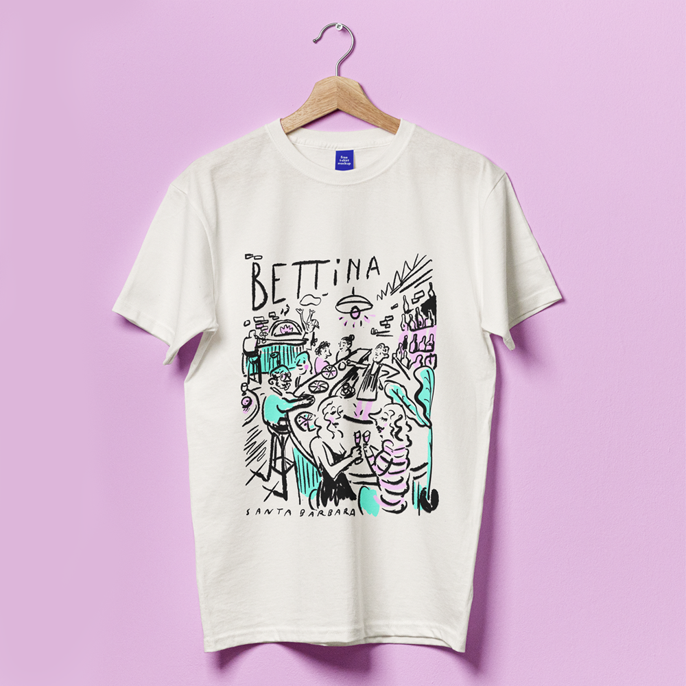
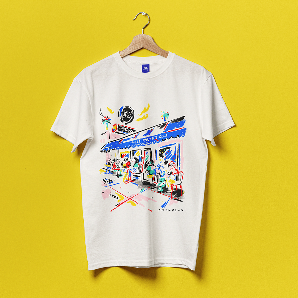
Jimmy Thompson created this lively, hand-drawn illustration for Bettina, the beloved Santa Barbara restaurant known for its wood-fired pizzas and convivial atmosphere. The design captures the spirit of a bustling Bettina evening—friends gathered around a table, the glow of the oven, bottles uncorked, and the joyful chaos of good food shared.
Rendered in Thompson’s expressive linework and accented with a playful, limited palette of mint and lavender, the artwork evokes a loose, spontaneous sketchbook quality. Figures, pizza slices, wine glasses, and architectural hints of Santa Barbara blend into a vibrant scene that feels both whimsical and unmistakably local.
Printed on a classic white tee, the illustration transforms a simple garment into a narrative moment: a snapshot of Bettina’s warmth and energy, interpreted through Thompson’s signature visual voice. The result is a keepsake that celebrates community, dining, and the artistry of everyday experiences.
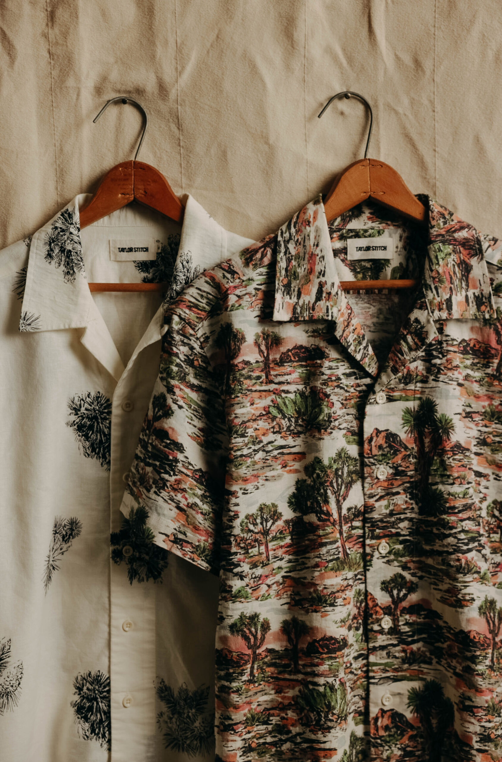
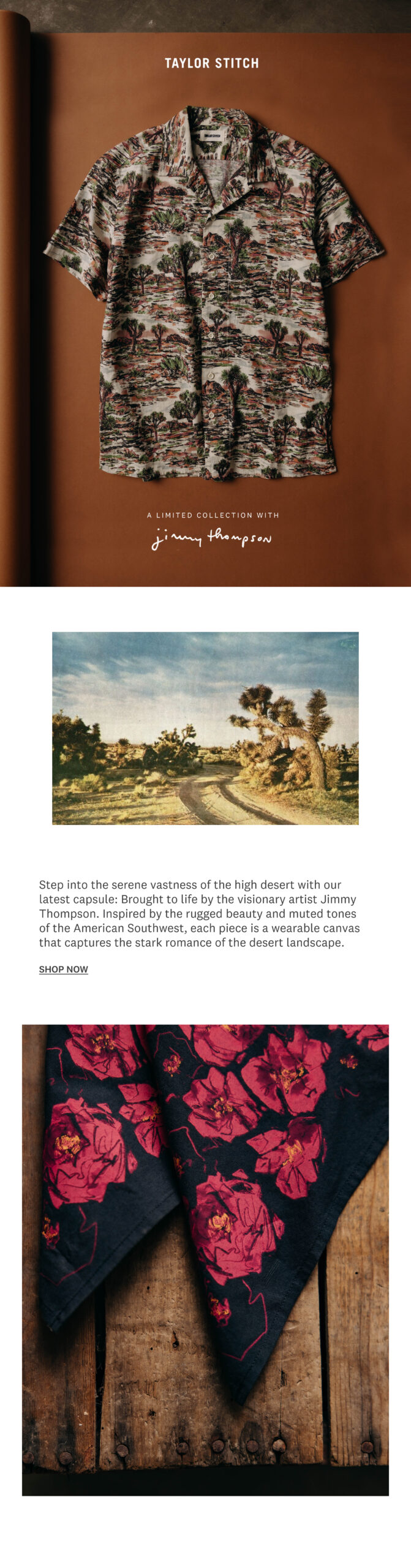
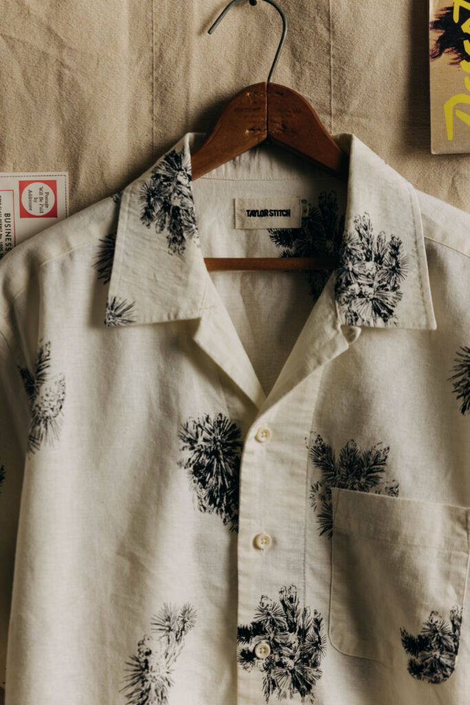
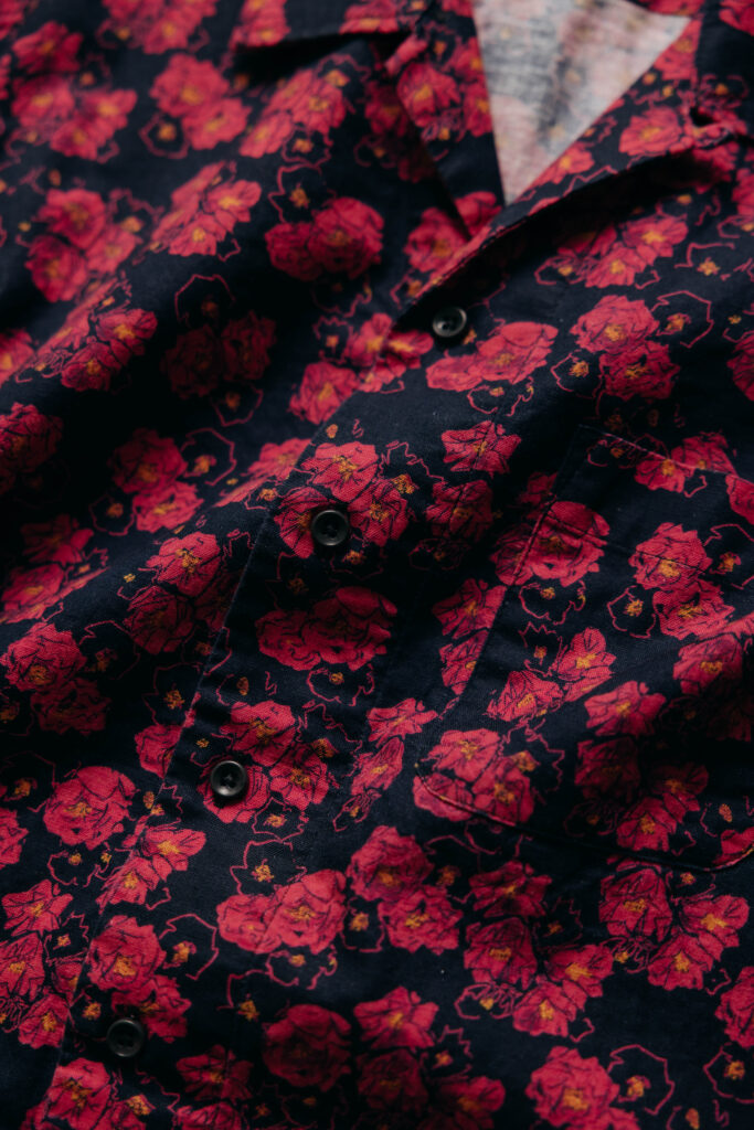
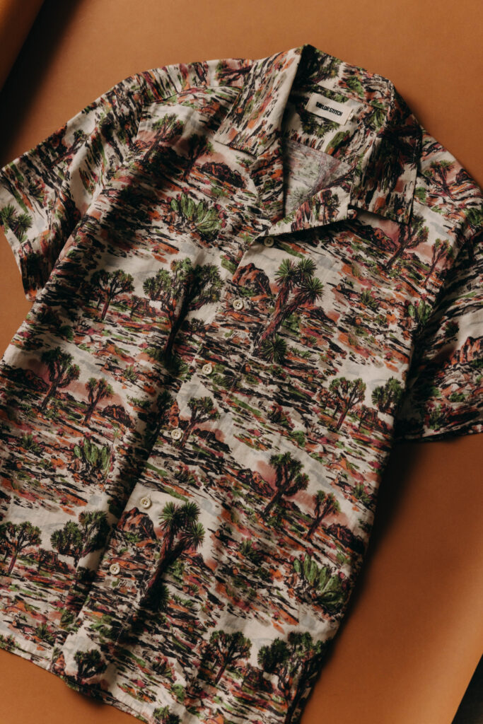
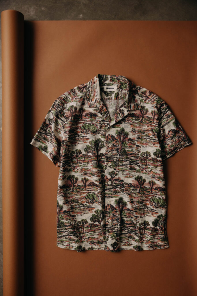
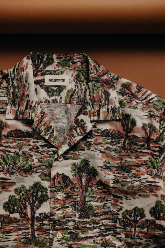
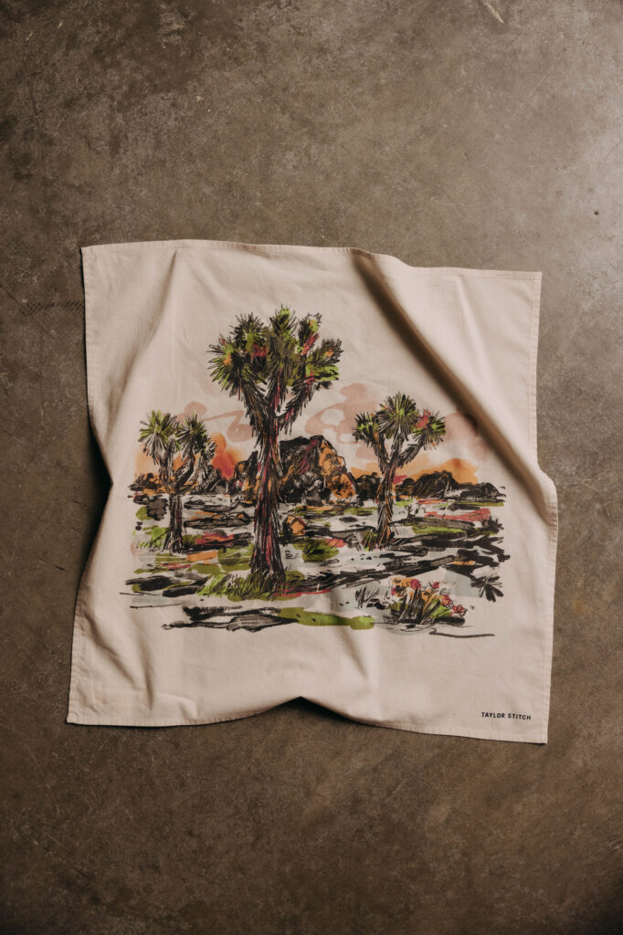
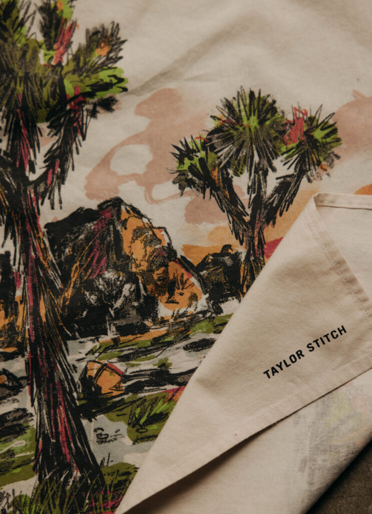
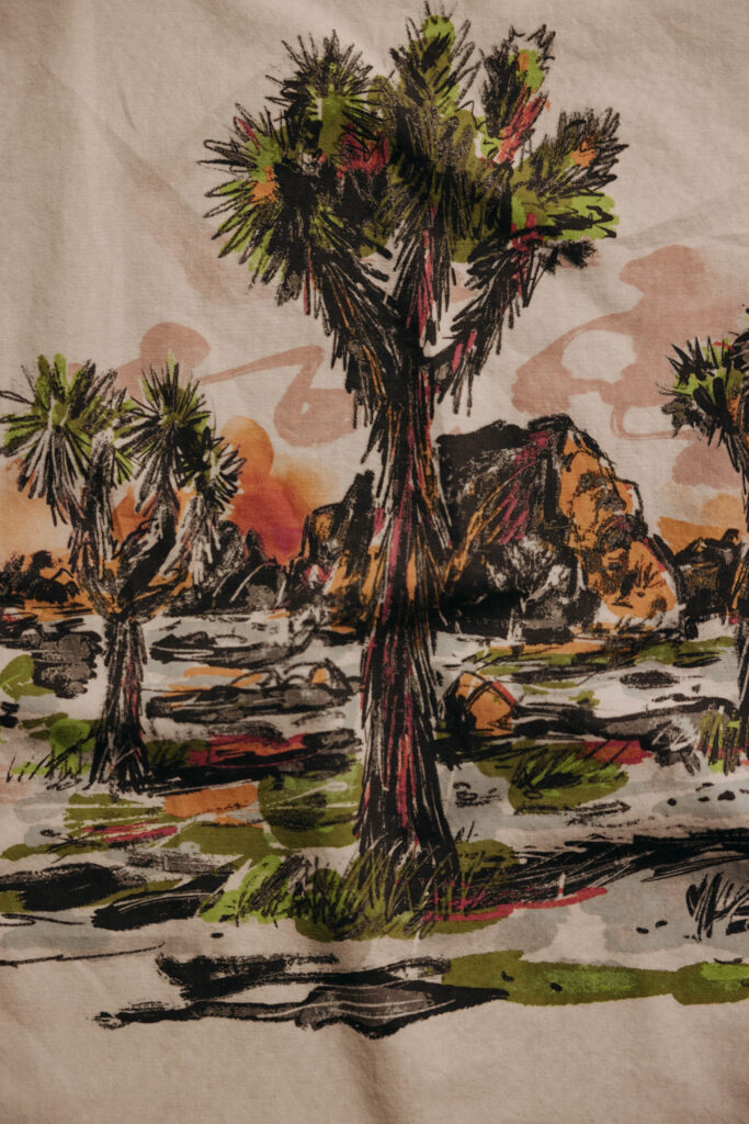
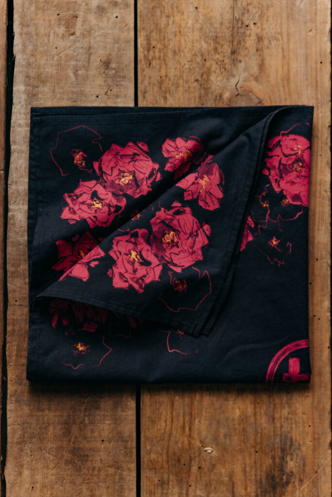
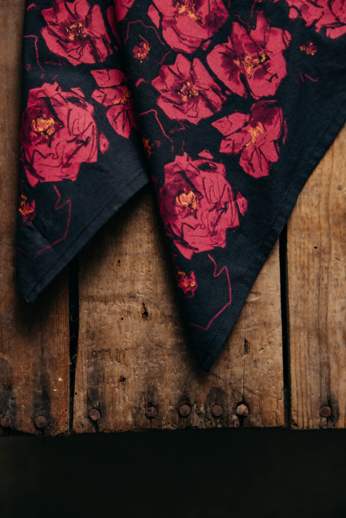
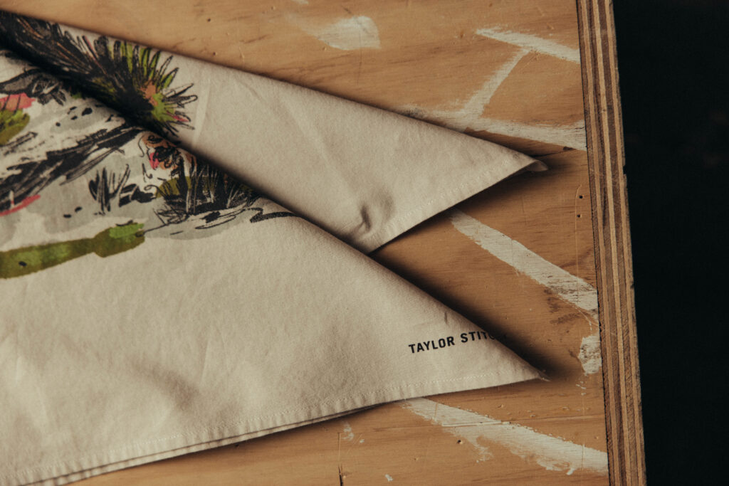
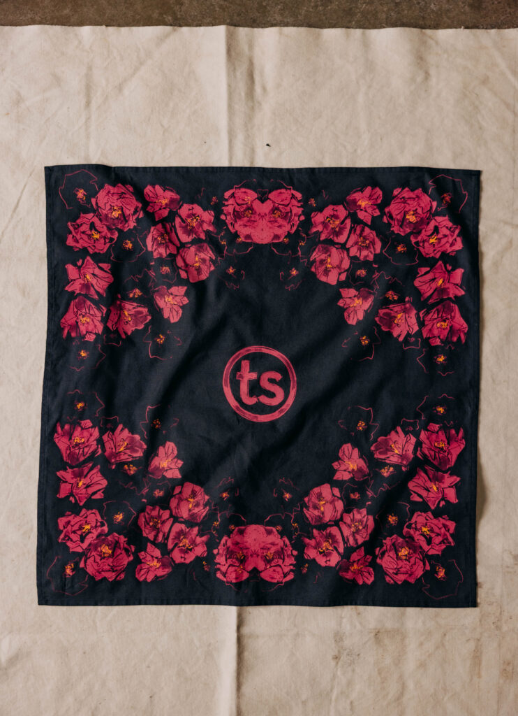
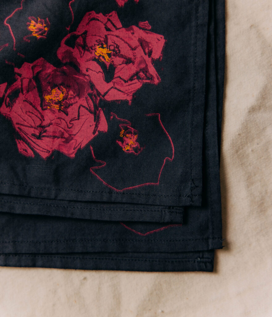
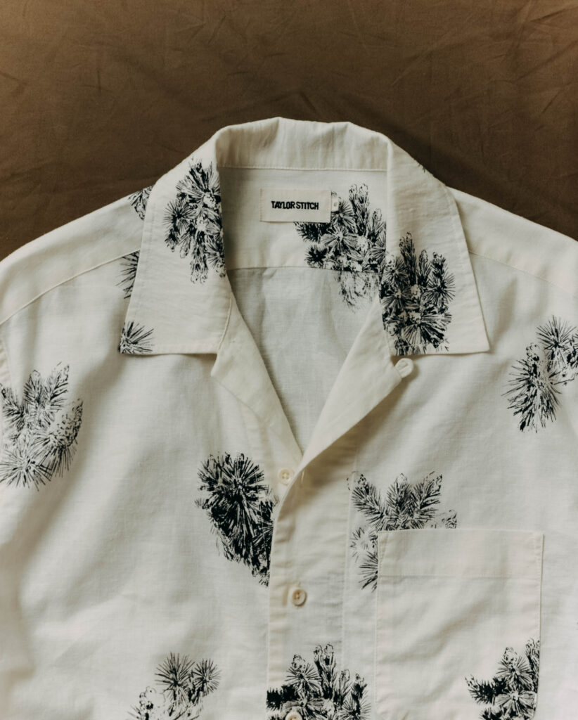
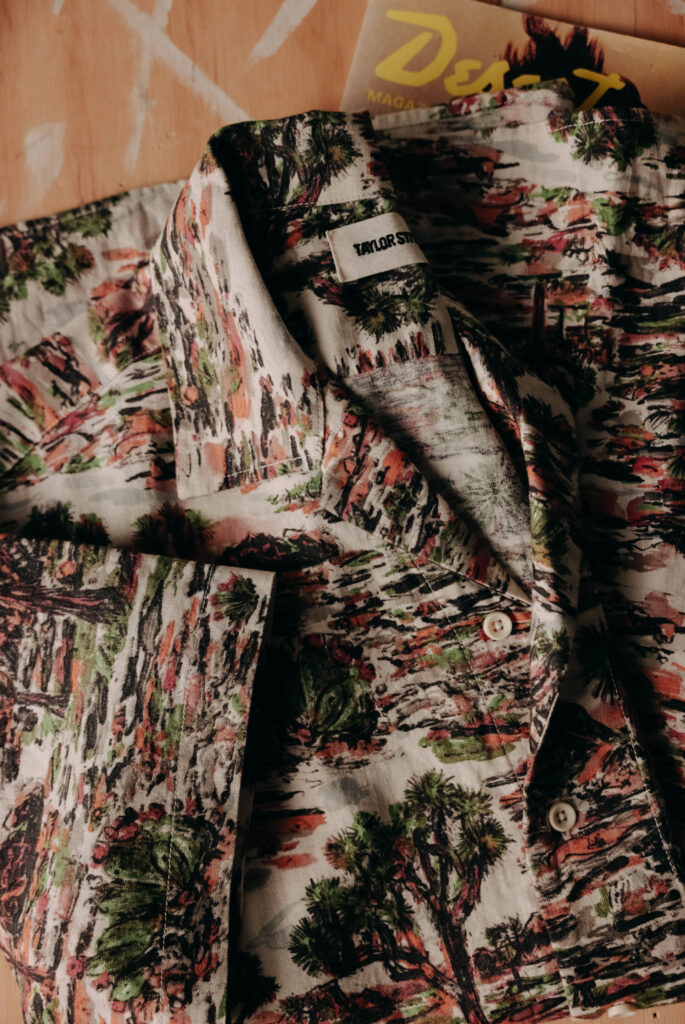
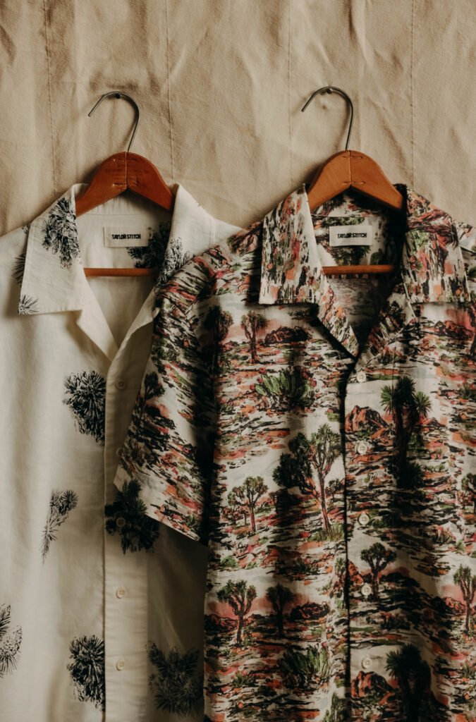
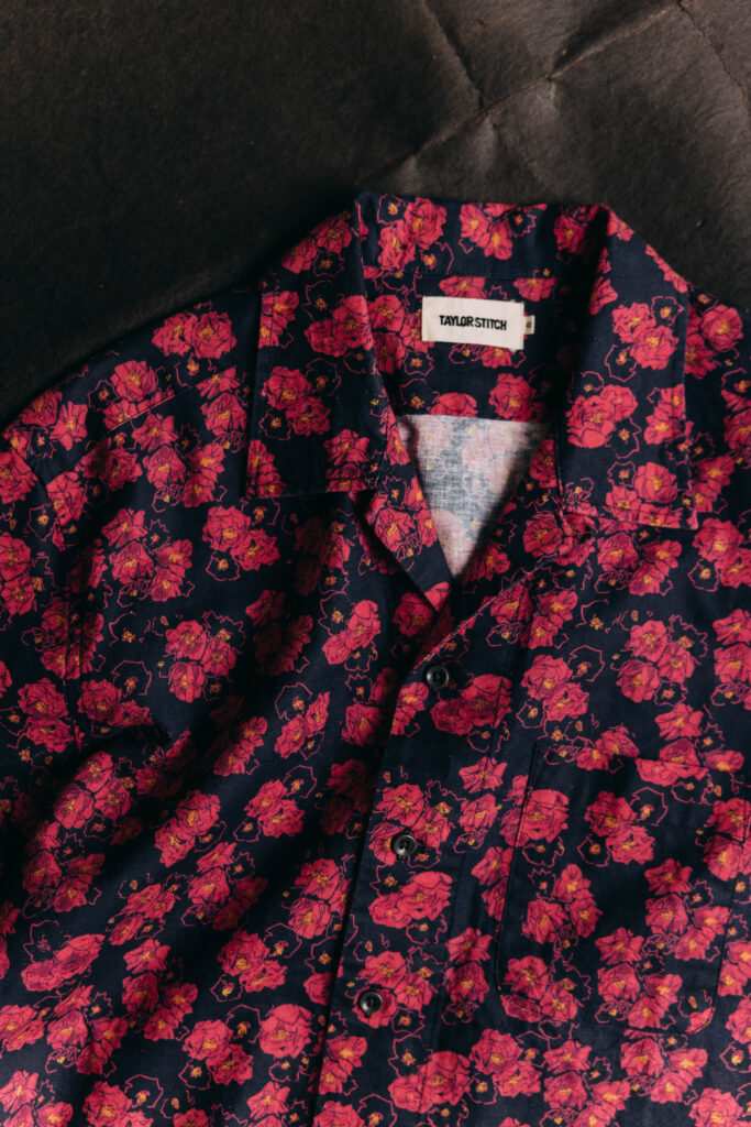
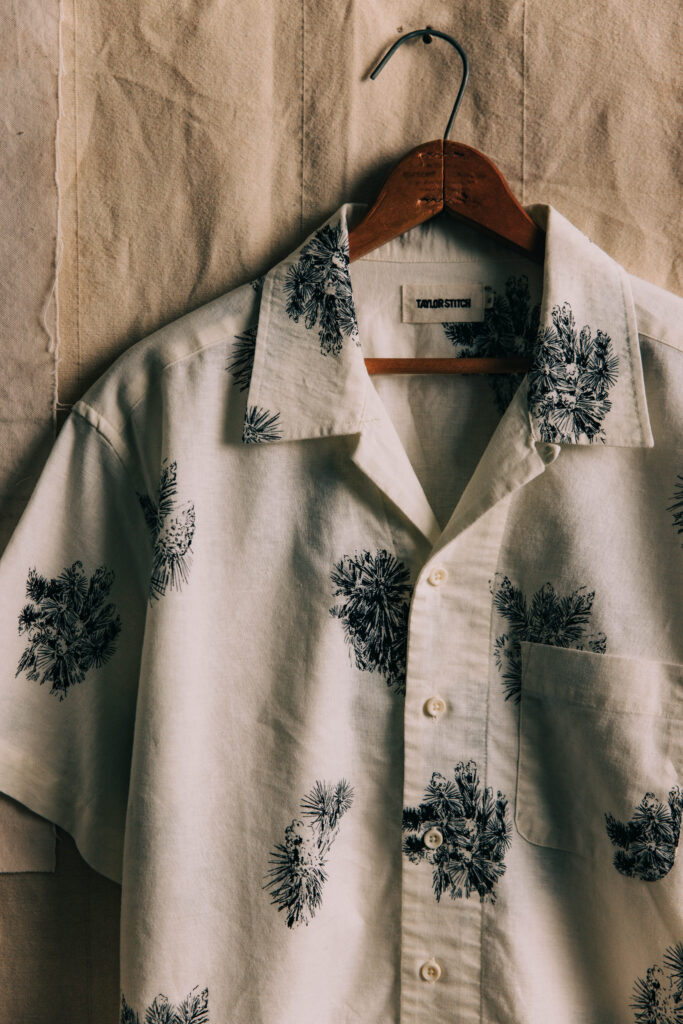
In collaboration with Taylor Stitch, Jimmy created a series of original textile prints inspired by the American Southwest. From hand-drawn Joshua trees and rugged desert landscapes to bold florals, his artwork translates the vastness and romance of the high desert into wearable pieces. Each shirt and bandana becomes a canvas—blending fine art with timeless craftsmanship.
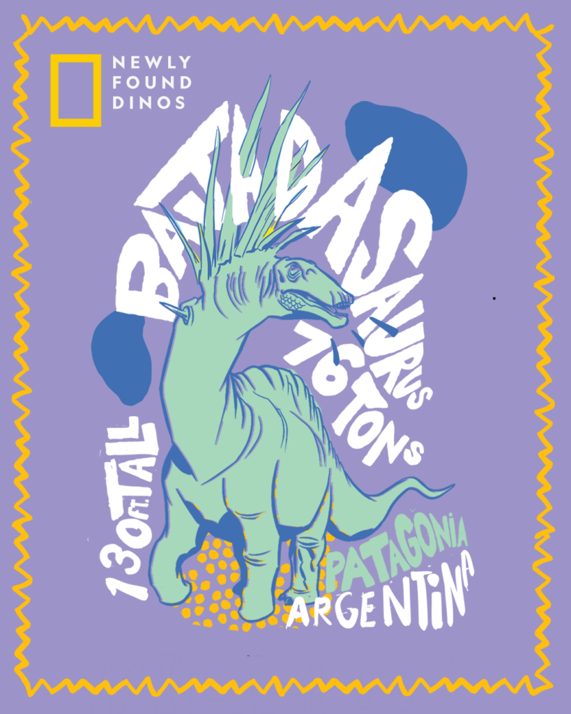
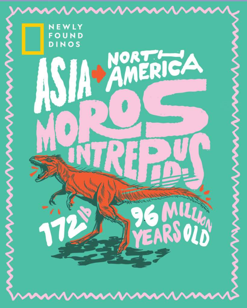
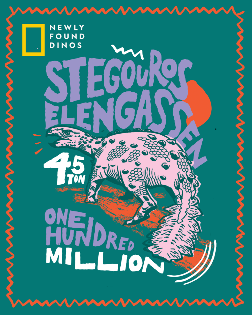
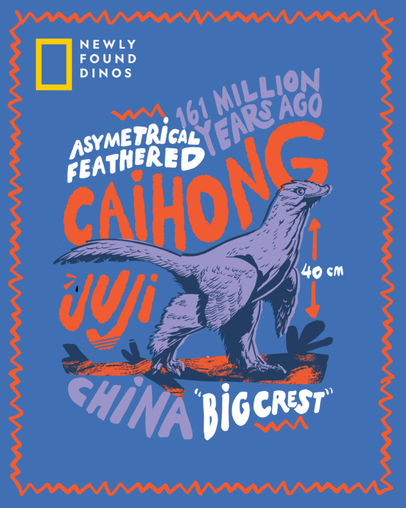
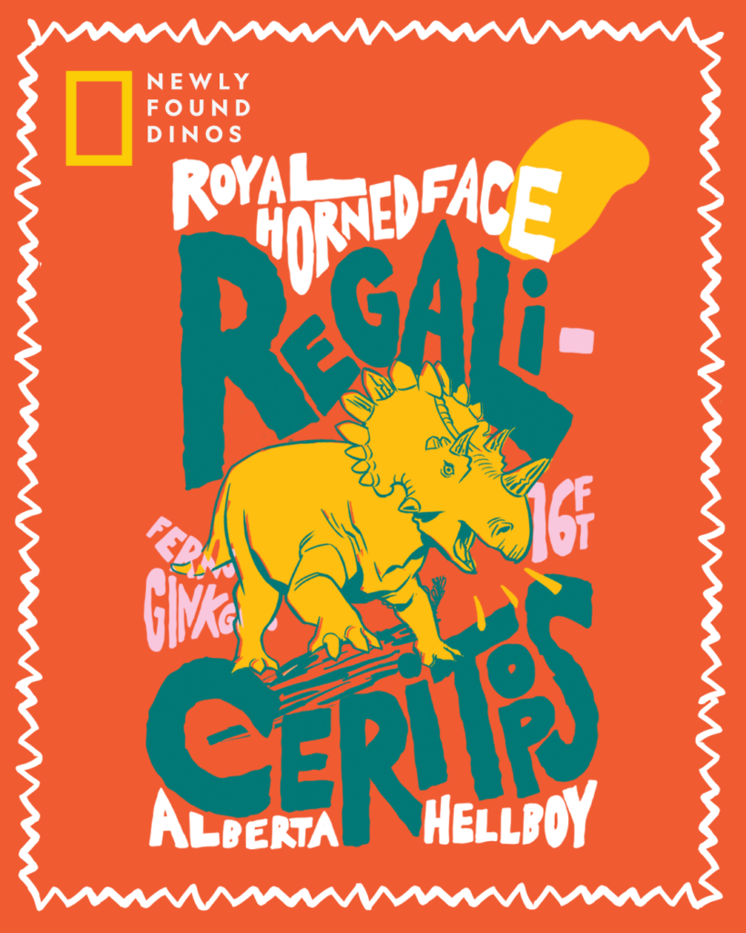
Commissioned by National Geographic, Jimmy created a bold, high-impact illustration series celebrating newly discovered dinosaur species from around the world. Designed to engage a younger audience, the series blends scientific facts with expressive typography, energetic color palettes, and character-driven dinosaur drawings—transforming paleontology into something playful, accessible, and visually electric.
Each poster spotlights a different species—such as Bathysaurus, Regaliceratops, Caihong juji, Stegouros elengassen, and Moros intrepidus—rendered in Thompson’s signature style: vibrant shapes, loose sketch-driven outlines, and a mix of matte and neon tones that bring prehistoric creatures into a modern visual language. Facts like height, weight, age, and discovery location are integrated directly into the compositions through hand-lettered typography, wrapping around and interacting with the dinosaurs themselves. This gives every piece a sense of motion and personality, turning raw data into graphic storytelling.
Across the series, Thompson uses punchy, unexpected color combinations—lavender with mint, coral with deep green, teal with blush pink—to defy the earth-tone conventions of dinosaur art. Border motifs and layered textures echo zines, trading cards, and retro posters, grounding the project in a fun, editorially playful aesthetic aligned with National Geographic’s youth programming.
The result is a set of illustrations that make science feel exciting and alive—bridging education and art through dynamic, contemporary design. Each piece invites the viewer into the world of newly discovered dinosaurs with curiosity, humor, and an unmistakable visual voice.
Jimmy collaborated with Tie Bar to design a series of illustrated pocket squares that transform everyday menswear accessories into expressive works of art. Each piece draws on Jimmy’s signature hand-drawn style, combining gestural linework, layered color, and narrative scenes to create pocket squares that feel both sophisticated and playfully human.
Winter Park Scene Rendered in inky black brushstrokes and soft gray washes, this design captures a serene snow-covered path lined with bare trees and glowing lampposts. The loose, almost calligraphic marks evoke the immediacy of plein-air sketching, turning a simple winter stroll into a cinematic moment of quiet romanticism.
Cocktail Illustration This vibrant square features a richly colored cocktail on a bar napkin, illustrated with bold strokes and lively reds, peaches, and plums. The sketchy, energetic linework gives the drink a celebratory feel—perfect for adding a conversational pop to tailored attire.
Parisian Café A bustling street-side café comes to life through Jimmy’s fluid lines and soft pastel accents. The scene is packed with movement—diners, awnings, lampposts, and city details—captured with the spontaneity of a travel journal. The muted sage background balances charm with sophistication.
City Skyline This pocket square features a dramatic urban skyline painted in loose, expressive strokes with soft lavender shadows and cool blue reflections. Jimmy’s illustration abstracts architecture into dynamic shapes, creating a moody yet modern accessory.
Holiday Sprigs Pattern The most pattern-driven design of the collection, this print layers sweeping evergreen fronds with bright red berries. Jimmy’s gestural brushwork creates a rhythmic, swirling texture that feels festive without being literal—a refined seasonal accessory with an artist’s touch.
Across the collection, Jimmy brings editorial illustration into fashion design, creating pocket squares that function as tiny pieces of wearable art. Each one carries his unmistakable blend of spontaneity, charm, and craft— elevating Tie Bar’s accessories with personality and story.
Jimmy created this animated illustration for Buck Mason’s Instagram campaign, bringing the craftsmanship of classic menswear to life through motion. The piece features a hand-drawn suit rendered in clean, expressive linework—an homage to vintage tailoring diagrams and archival pattern books.
As the animation unfolds, measurement marks, notations, and garment details appear one by one, as if drafted by an old-world tailor’s pen. Subtle movements—stitch lines forming, seams tracing themselves, proportions being measured—give the illustration a tactile, analog feel despite its digital execution. The pacing is deliberate and meditative, mirroring Buck Mason’s ethos of slow, intentional craftsmanship.
The monochrome palette and minimal aesthetic place full emphasis on the artistry of construction: lapel shapes, pocket placements, shoulder lines, and fit proportions emerge with clarity and confidence. The result is a quiet yet compelling piece of branded storytelling—one that bridges heritage tailoring with modern design sensibility, all through Jimmy’s signature illustrative touch.
Perfectly suited for social media, the animation offers a moment of visual poetry amid the scroll, reminding viewers of the beauty inherent in well-made garments.
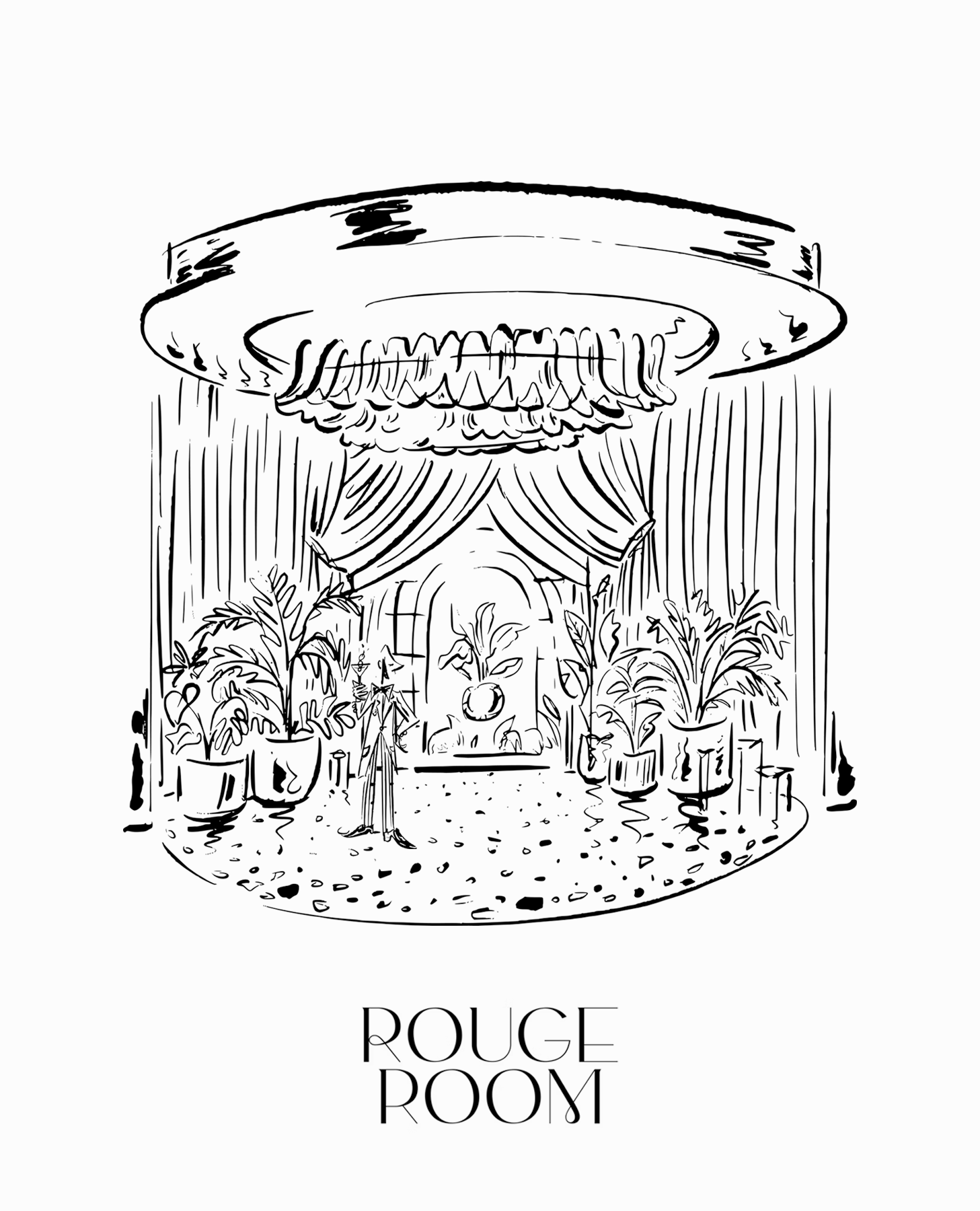
Jimmy created this expressive illustration for Rouge Room, capturing the venue’s opulent, mood-driven atmosphere through loose, gestural linework. The drawing depicts the signature circular stage framed by cascading drapery, lush potted palms, velvet textures, and an ornate ceiling fixture—evoking the glamour and intimacy of old-world lounges with a modern twist. Rendered entirely in black ink strokes, the piece feels alive with movement, as if sketched on-site during a quiet moment before showtime.
To extend the artwork beyond the still image, Jimmy also produced an animated companion video in the same hand-drawn style. In the animation, a live band begins to play: instruments pulse, silhouettes sway, lights flicker, and the once-static room breathes to life. The animation mirrors the loose, expressive marks of the original drawing, giving the entire scene a fluid, atmospheric energy. The result is a seamless blend of illustration and motion that captures the Rouge Room’s identity—lush, theatrical, and alive with sound.
Together, the illustration and animation form a cohesive visual language for the venue, showcasing Jimmy’s ability to translate ambience and architecture into art that moves, performs, and invites the viewer into the room.
Jimmy created this vibrant poster series for National Geographic, illustrating distinct ecological regions across the globe with his bold, modernist visual style. Each piece functions as a stylized travel poster—merging graphic clarity, saturated color palettes, and simplified natural forms to celebrate the diversity of our planet’s landscapes.
Aceh, North Sumatra In this composition, a pair of gibbons moves across a sunlit branch, framed by tall coral-toned trees and layered jungle foliage. Thompson strips the rainforest down to expressive shapes and warm pastel hues, capturing the gentle motion and intimacy of life in the canopy. The piece evokes the humid, atmospheric quiet of Sumatra’s forests while keeping the imagery playful and approachable.
Tarma, Central Peru This poster transforms the Andean highlands into a dreamlike, color-blocked landscape. A magenta mountain rises dramatically against a soft blue sky, with rolling fields and stylized vegetation radiating outward in bold stripes and geometric contours. Thompson’s use of unexpected color—pink peaks, teal shadows, apricot sun—turns the region’s rugged terrain into a vivid, contemporary scene.
Beni River, Bolivia Depicting the lush river valley leading toward a towering sandstone cliff and cascading waterfall, this illustration highlights the dramatic contrast between Bolivia’s steep rock formations and its fertile river plains. Thompson uses sweeping lines and layered greenery to guide the eye through the composition, creating a sense of depth and motion. The palette—cool blues, warm ochres, and bright mint greens—invites viewers into a serene yet powerful landscape.
Across the series, Thompson balances editorial storytelling with graphic minimalism, resulting in illustrations that feel both iconic and emotionally resonant. Each piece honors National Geographic’s legacy of exploration while presenting the natural world through a fresh, design-forward perspective.